We’re at odds on all
things, but one. I concede. Your
fall sunsets are best.
An online commonplace book
We’re at odds on all
things, but one. I concede. Your
fall sunsets are best.
Thunder knocks against
the drywall. Rain taps against
the flue. Silence waits.

Handwriting, penmanship, this is all drawing. Hand-lettering can be another artistic tool to add to your kit.
Matthew Frederick shares 6 architectural hand-lettering principals to follow:
1. Honor legibility and consistency above all else.
2. Use guide lines (actual or imagined) to ensure uniformity.
3. Emphasize the beginning and end of all strokes, and overlap them slightly where they meet – just as in drawing lines.
4. Give your horizontal strokes a slight upward tilt. If they slope downward, your letters will look tired.
5. Give curved strokes a balloon-like fullness.
6. Give careful attention to the amount of white space between letters. An E, for example, will need more space when following an I than when coming after an S or T.
Matthew Frederick
This week, for fun, find ways to practice your architectural hand-lettering.
Write a thank-you note.
Write a love letter.
Write a haiku.
Then mail it out it to your lover, mother, or bestie.
Be sure to practice your hand-lettering on the to and from address on the envelope as well.
You’ll get some practice in, and they will receive a special gift.
Source: 101 Things I Learned in Architecture School, Matthew Frederick, pg 22

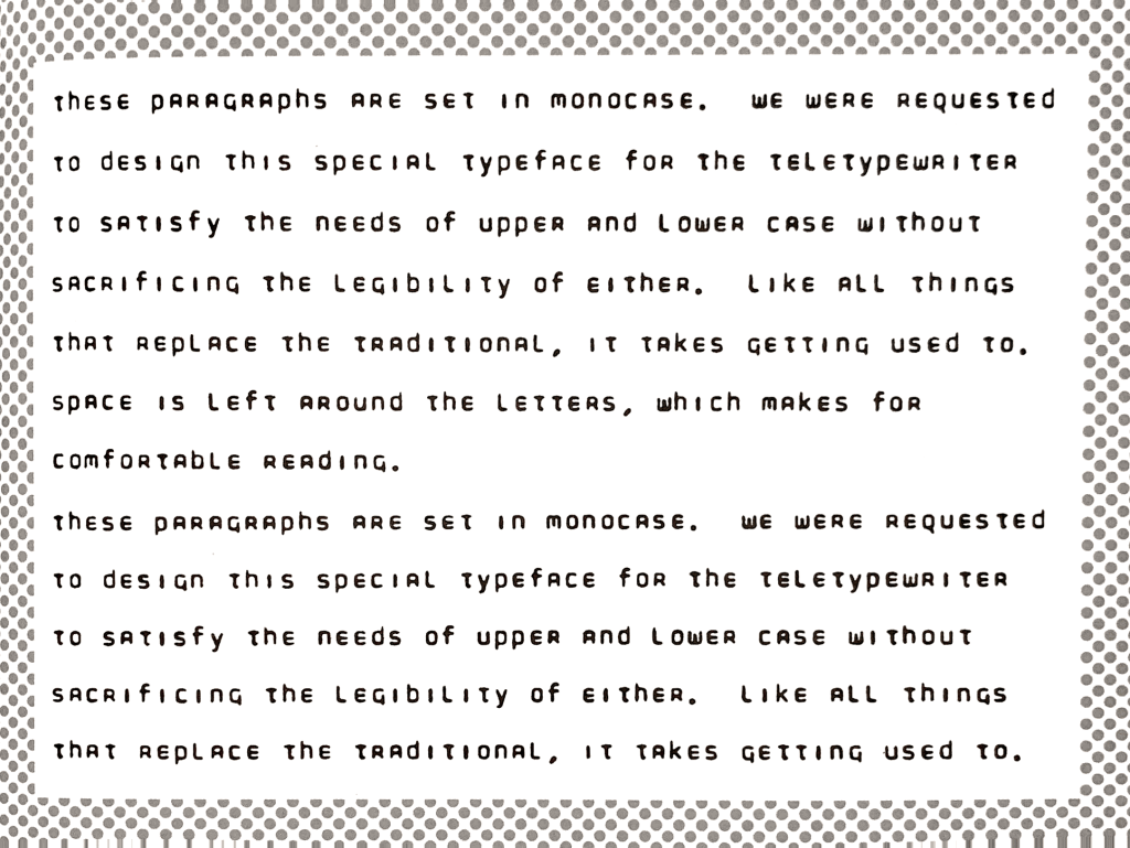
Doyald Young invented Teletype Monocase font in 1965.
Teletype was a precursor to SMS messages. A digital method for sending text between phone lines.
But there was one problem.
Teletype couldn’t handle upper or lower case letters.
Doyald Young was brought into to solve this problem. He was tasked with creating a font that would appear set in lower-case, but not offend its recipients when their proper names weren’t capitalized.
The monocase font was never used.
It was quote:
“was hard to read and didn’t fool anybody,”
An engineer
Source: Earthquakes, Mudslides, Fires & Riots: California and Graphic Design, 1936-1986, by Louise Sandhaus, Lorraine Wild, Denise Gonzales Crisp, pg.96

Aaron Linton? A mystery.
His website is simple. A two page nav – Images and Contact.
No “about me”. No “start here”.
I dig.
No Twitter. No Facebook. Not even instagram.
I dig even more.
Only a collection of stunning images assembled with mixed materials.
His art is like stop motion animation on pause.
Have a look: https://www.aaronlinton.com/
From: Comics: Easy as ABC! The Essential Guide to Comics for Kids
By: Ivan Brunetti

Brian Roppel’s comics are action packed. His panels explode with movement.
Looking at his art brings back the same delight I got watching Nicktoons as a kid.
Based in Toronto, Brian works in multiple mediums – comics, illustration, and animation.
Check out his back catalog here.
From: Comics: Easy as ABC! The Essential Guide to Comics for Kids
By: Ivan Brunetti
The hour glass flips.
Each grain precious. Each grain a
choice. How do we choose?
June’s afternoon heat
burns the egg shell leather of
his two door coffin.
A lit match unites
desert tribes. Cowers. Ashamed
of his blood soaked blade.
Prince of Persia was hard as…<shout favorite swear word here>.
That’s my lasting memory of it.
The protagonist, we’ll call him Prince, felt so heavy during gameplay. I was accustom to games like Super Mario Brothers. Mario and Luigi were light. They had spring when they jumped. They could don a racoon tail to float and fly past foes.
Prince of Persia? Na man. The Prince had weight. The realm had gravity. And as I learned, this was by design.
The game’s creator – Jordan Mechner explains:
What if we combined that gameplay with a charachter who’s so human feeling that you feel like if you miss the jump and you fall, it’s really going to hurt?
Because in the early platform games charachters were kind of weightless. You know, you would jump, and you’d make it or not, but you’d float down to the bottom. It didn’t feel like you could really get hurt.
Jordan Mechner
This War Stories video is a revealing look at the process behind creating a video game.
Toil and grit man.
Toil and grit.
Have a watch:
Bonus Jam: Jordan’s new book, The Making of Prince of Persia: Journals 1985-1993–Illustrated Edition is out now.