It was on sale.
I’d imagined I ordered a simple, white jersey. Another they all-look-the-same MLS shirt, brought to you by Adidas since 2004.
But a closer look revealed a delicate design, quiet even.
And unless you’re pulling the shirt over your head for Saturday morning pick-up, the small details are easily missed.
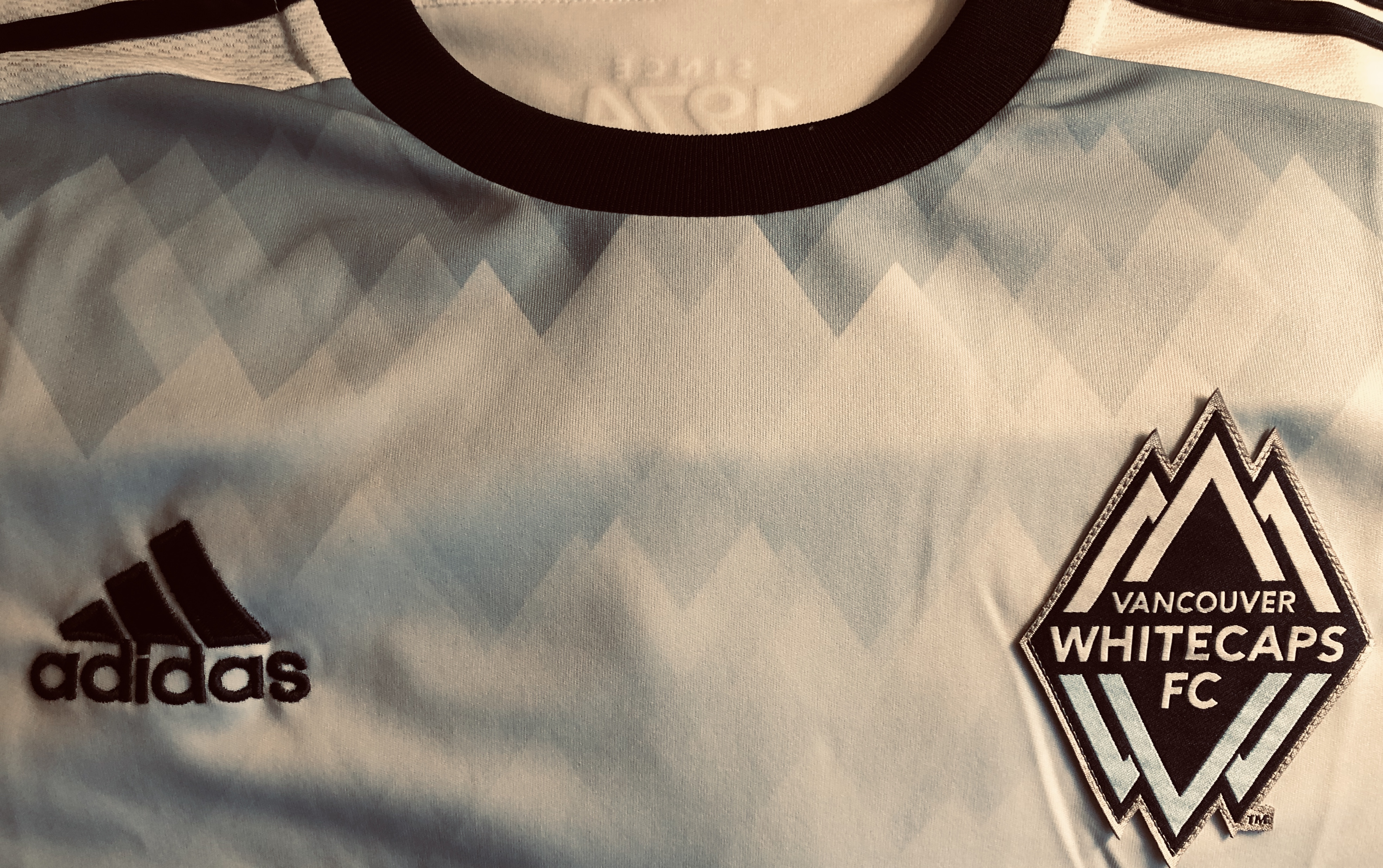
The shirt is both modern and retro. Harking back to the Whitecap’s NASL days, the tag below the collar reading: Since 1974.
“No that’s not the year I was born.” I explain to my teammates. It’s when the Vancouver Whitecaps were foun…oh never mind.

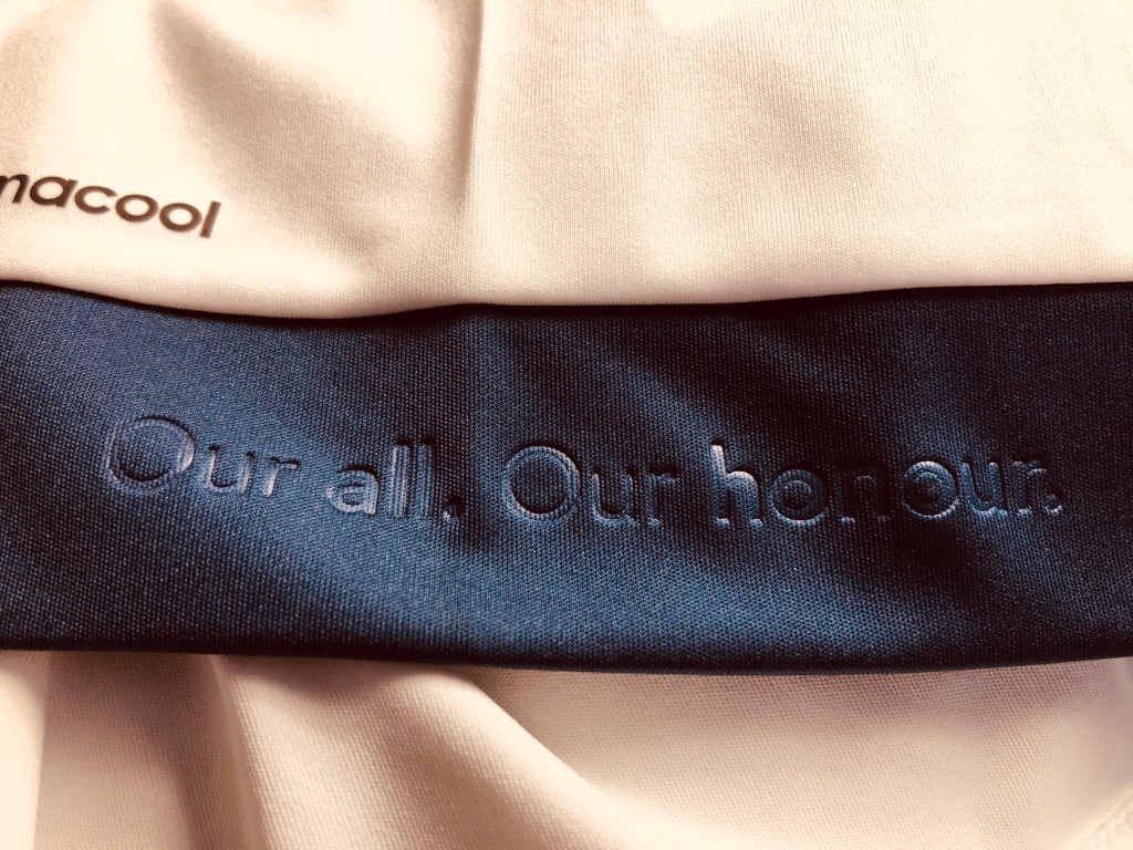
The club motto – Our all. Our honour. hides below the nape on the inside collar.
A perfect mental lift when playing indoor 5-aside, and all oxygen has escaped your lungs, but your team has no subs.

The slogan reappears on the navy strip near the waist. Helpful again, when stricken with side stitch.
Across the upper chest are the fade-to-blue-to-white jagged edges of the North Shore mountains. An homage to the local landscape. And yes, I googled “Mountains in Vancouver”.
True kit aficionados know a classic shirt sponsor can unify the entire design.
See D.C. United’s all black VW shirts. Or Fiorentina’s Nintendo kit.
The Bell logo knits all the design elements together, and isn’t a too obnoxious plea for market share.

Kit diversity is missed when one brand sponsors a whole league. The styles become repetitive, homogeneous, dull.
Somehow the Vancouver Whitecaps 2015-2016 shirt escaped this fate.
Further reading: Graham Ruthven on kit designs and the MLS adidas partnership.
