Merry Christmas!
In my mind each season has a specific cartoonist assigned to it.
John Porcellino is fall. None better than John at depicting a walk on a chilly fall day.
Bill Watterson is summer. Watterson is an all season cartoonist, but his panels of Calvin and Hobbes’ summer break hi-jinks are unforgettable.
We’ll go Charles Schultz for spring. Charlie Brown is a baseball player, no question.
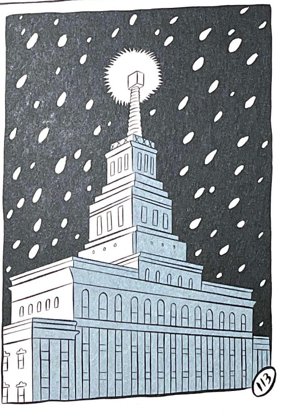
Winter? Which cartoonist leads us into winter best?
SETH.
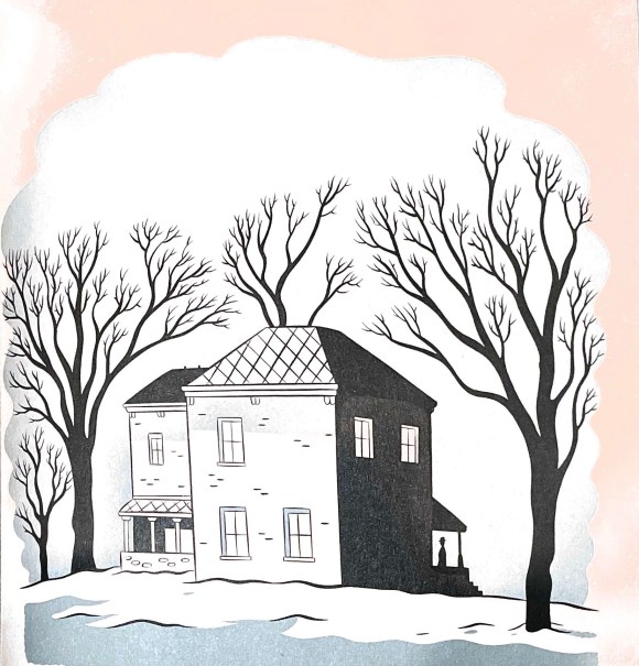
The drawings in Seth’s classic winter tome – It’s a Good Life, If You Don’t Weaken. depict a frigid, contemplative, Canadian winter in a variety of settings:
A packed, pre-Christmas main street.
A government building taking in a snow storm.
A lonely house sitting in silence.
And a windy walk home.
World building at its finest.
See you next week.
From: It’s a Good Life, If You Don’t Weaken: A Picture Novella
By: Seth