Nothing is so real to me as the illusions I create with my painting. The rest is shifting sand.
— Eugène Delacroix
Grant, R. G., et al. Remarkable Diaries: The World’s Greatest Diaries, Journals, Notebooks, & Letters. United States, DK, 2020.
An online commonplace book
Nothing is so real to me as the illusions I create with my painting. The rest is shifting sand.
— Eugène Delacroix
Grant, R. G., et al. Remarkable Diaries: The World’s Greatest Diaries, Journals, Notebooks, & Letters. United States, DK, 2020.
New Yorker.
Crooner.
Painter.
Maestro.
In memoriam, some favorite quotes:
“I knew very early that somehow I would sing and draw and paint my whole life.“
pp 20
“There’s a push and pull with the creative process. That’s why I learned never to give up, even if it feels as if it’s not happening the first time around. Keep going; keep plowing through it.“
pp 128
“I wasn’t in the Rat Pack. I was in New York; they were out there. I had my singing and painting.”
pp 57
From: Bennett, Tony. Sullivan, Robert. Tony Bennett in the Studio: A Life of Art & Music. New York: Sterling Publishing, 2007.
In an age when AI can write songs and poems for you, the human edge will come not in what we generate, but in what we save, what we collect, and how we arrange the data. We find this idea in Walter Benjamin, who praises the collector as one who redeems objects, by bringing them into constellation with one another. We find it in the work of Mallarmé, for whom chance is the great anthologist. We find it in Nietzsche’s revisionist philosophy of history, according to which the task of the historian is less to remember the past as it was than to use it, recontextualize it. We find it in the art of Joseph Cornell, for whom art is fundamentally arrangement.
Atkins, Zohar. Curation Over Creation: In Praise of the Anthologist. June 6, 2023, What is Called Thinking newsletter
Curation has merit. With an AI abundant world on the horizon, curation could rise in value.
JEAN JULLIEN: Can you remember when I first started to draw?
SYLVIE JULLIEN: As far as I’m concerned, you’ve always drawn. You’ve been doing it ever since you were able to pick up a pencil. You didn’t “learn”
BRUNO JULLIEN: You drew all the time, even on tablecloths when we were out at restaurants. It was your way of expressing yourself, of describing the tiniest routine events. You did this in sketchbooks that you would carry around with you, the ones we would offer you regularly. It was a ritual.
JJ: Yes, you gave me my first sketchbook. When I was at school in Quimper (a city in northwest France), my teacher Jacques Vincent encouraged us to keep a journal. There wasn’t much in the way of rules; the idea was to get us to draw and draw and draw so that we developed a visual language. And what better way to do that than to look for inspiration in what is around you? I think that my practice of drawing every day and my interest in everyday life come from that exercise.
Jullien, Jean. Jean Jullien. New York: Phaidon Press Inc, 2022. (see page 35)
Having Jean Jullien’s parents share his drawing origin story is a wonderful approach. Our origin stories must look different to our parents, who if they were around, watched them manifest in real time.
The idea of keeping a drawing journal seems beneficial for developing your own visual language. Your own style.
Keep drawing.
MZS: How do you work out ideas for costumes before they’re sewn? Do you draw rough versions of them in a sketchbook and then have somebody do more elaborate illustrations when the ideas have settled a bit?
MC: On the other two movies I did with Wes, The Life Aquatic and the Darjeeling Limited, I applied traditional sketching methods to design the look of the characters. On this one, our illustrators used both Photoshop and traditional sketching to incorporate Wes’s and my own ideas. With Photoshop we could get very close to the actors’ likenesses, and then easily do variations and send them to Wes via e-mail. The actors were very pleased because they could relate easily to how their character would look. Having worked on two of Wes’s other movies, I had already worked with some of his “ensemble” actors and it was interesting to change them again to these other characters. Wes had decided that all the men in the movie would have moustaches or beards, save for Jopling and the nasty sergeant in the train. I loved this idea, and it is curios that hardly anyone notices this detail–but it gives a style to the men’s looks.
Zoller Seitz, Matt. The Wes Anderson Collection: The Grand Budapest Hotel. New York: Abrams, 2015 (see page 89)
Costume design is an overlooked art form. When done well it’s hardly noticed, but adds to the world as a character. The 2017 American film Lady Bird is an excellent example. Anyone who grew up in 90s suburban America will recognize that movie and say yes! Yes! That’s exactly how a pre-teen leaving mass would dress 30 years ago.

Handwriting, penmanship, this is all drawing. Hand-lettering can be another artistic tool to add to your kit.
Matthew Frederick shares 6 architectural hand-lettering principals to follow:
1. Honor legibility and consistency above all else.
2. Use guide lines (actual or imagined) to ensure uniformity.
3. Emphasize the beginning and end of all strokes, and overlap them slightly where they meet – just as in drawing lines.
4. Give your horizontal strokes a slight upward tilt. If they slope downward, your letters will look tired.
5. Give curved strokes a balloon-like fullness.
6. Give careful attention to the amount of white space between letters. An E, for example, will need more space when following an I than when coming after an S or T.
Matthew Frederick
This week, for fun, find ways to practice your architectural hand-lettering.
Write a thank-you note.
Write a love letter.
Write a haiku.
Then mail it out it to your lover, mother, or bestie.
Be sure to practice your hand-lettering on the to and from address on the envelope as well.
You’ll get some practice in, and they will receive a special gift.
Source: 101 Things I Learned in Architecture School, Matthew Frederick, pg 22

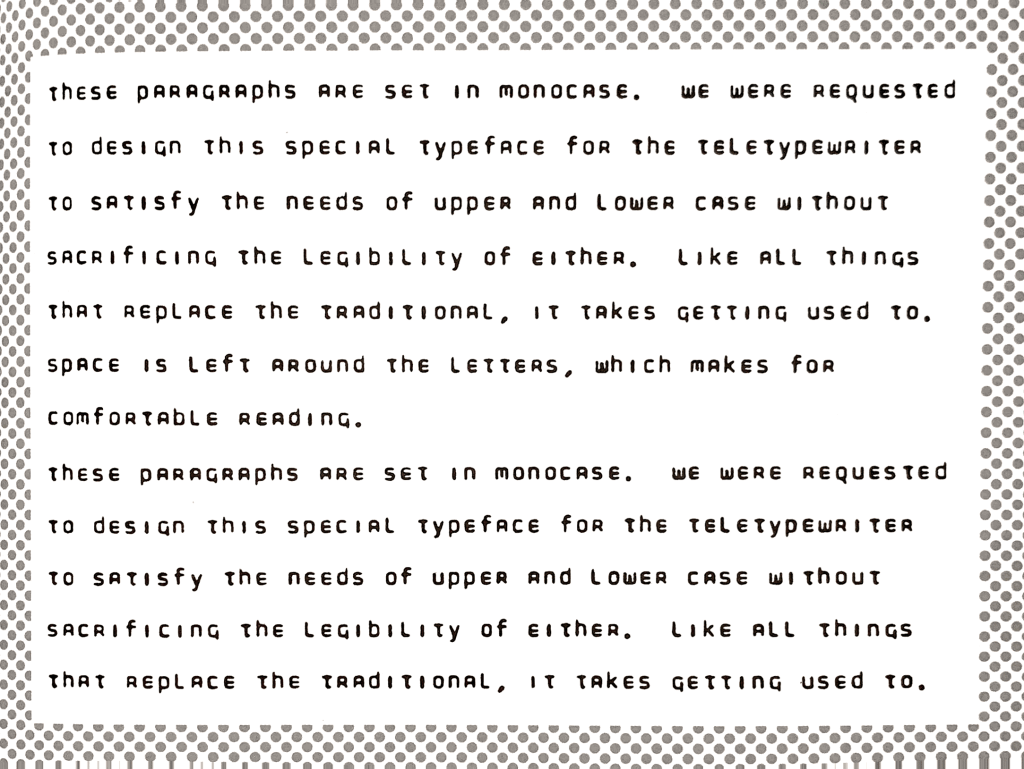
Doyald Young invented Teletype Monocase font in 1965.
Teletype was a precursor to SMS messages. A digital method for sending text between phone lines.
But there was one problem.
Teletype couldn’t handle upper or lower case letters.
Doyald Young was brought into to solve this problem. He was tasked with creating a font that would appear set in lower-case, but not offend its recipients when their proper names weren’t capitalized.
The monocase font was never used.
It was quote:
“was hard to read and didn’t fool anybody,”
An engineer
Source: Earthquakes, Mudslides, Fires & Riots: California and Graphic Design, 1936-1986, by Louise Sandhaus, Lorraine Wild, Denise Gonzales Crisp, pg.96
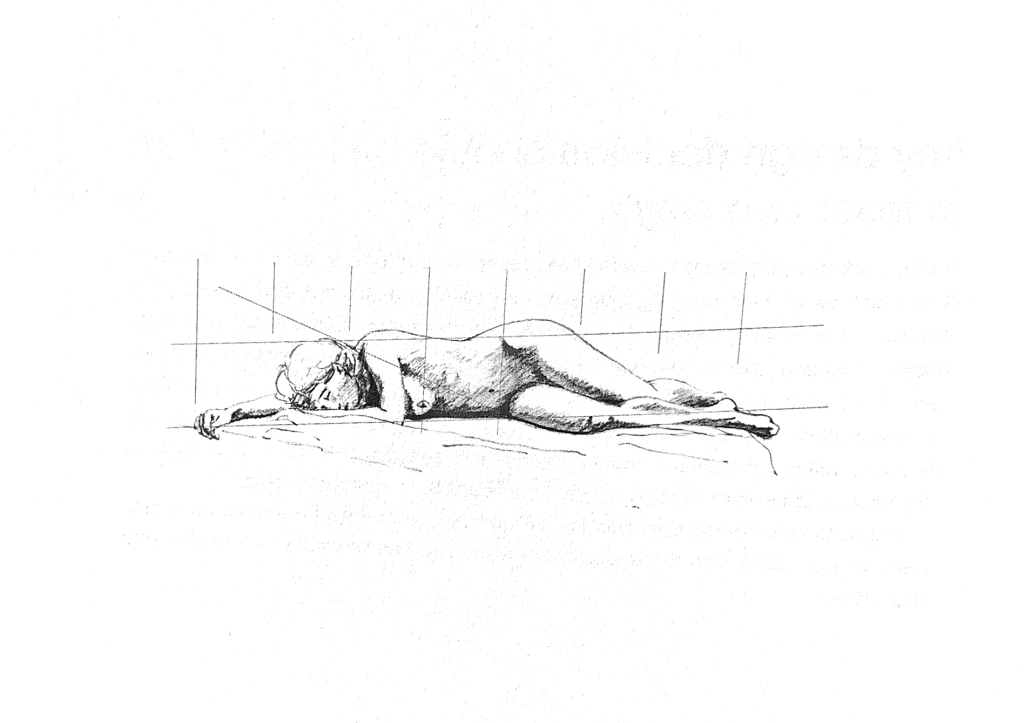
Every drawing you undertake has a hierarchy. There are the general elements. And there are the fine details.
Matthew Frederick recommends laying out the entire drawing to start.
How?
By making use of:
Light guide lines.
Geometric alignments.
Visual gut-checks.
These techniques will help ensure the proportions and placement of shapes are accurate.
After that hit the details. But don’t over indulge in one place:
When you achieve some success at this schematic level, move to the next level of detail. If you find yourself focusing on details in a specific area of the drawing, indulge briefly, then move to other areas of the drawing.
Matthew Frederick


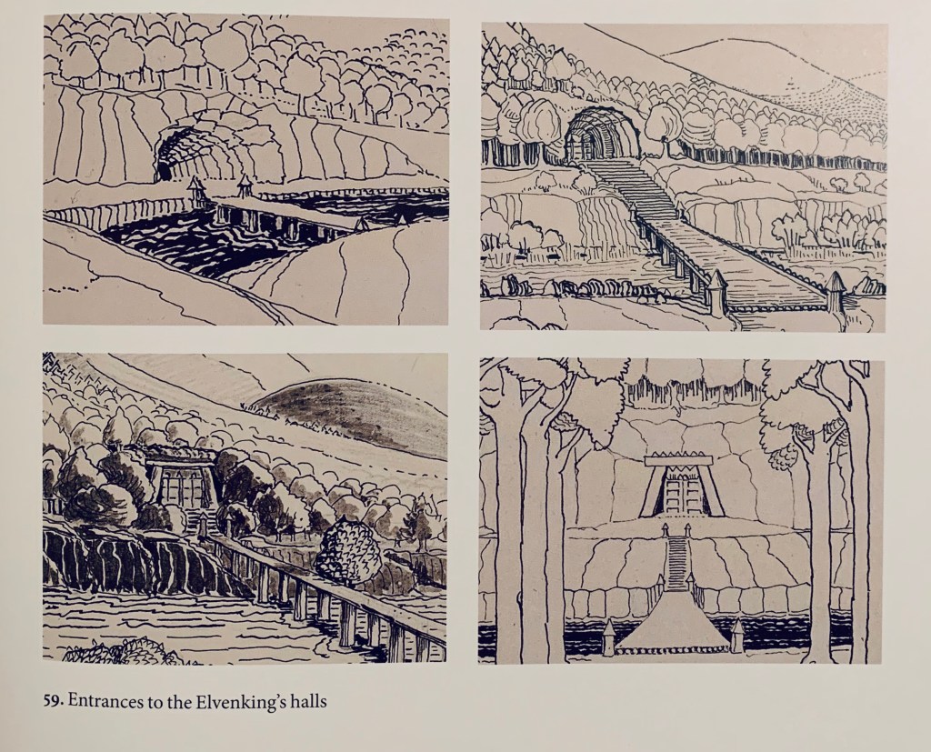
Ok. These aren’t exactly comic panels.
But the more I go through old books during this time spent at home, the more I discover “four panels” in other parts of literature.
Tolkien’s perspective and line variation are impressive. He incorporates straight lines, diagonal and curved lines, stipples, blacked out inks.
The man was non-stop.
Mindless drawings fill
pages with rockets, monsters,
and bug eyed portraits.