The Volkswagen logo origin is shrouded in mystery.
Austrian engineer Franz Xaver Reimspiess is said to have received a one time payment of 100 Reichmarks for the logo. Other claims say German artist Martin Freyer designed it for a contest. And in 2005, graphic designer Nikolai Borg went to court for his claims of design ownership.
From what the internet says, the mystery remains unsolved.
This is the 67′ edition of the logo, captured from the hood of a 67’ Beetle.
Neil Gaiman’s script work on Sandman is well known. But he also drew comics for fun. Inspired by Steve Bissette’s 24-hour comic day shenanigans, Neil drew a four panel comic about his shades.
I haven’t been surprised by the internet in a while. There’s all the common rants:
Social media sucks! Social media is the life changing wonder stick!
Substack sucks!Subtsack is majestical!
The 90s was the best decade ever!No! The 60s were utopia!
And all the other back-and-forth of opinions and wild fantasies that the internet harbors.
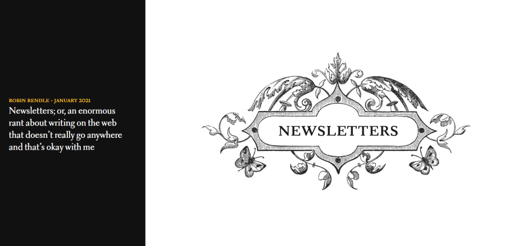
But then Robin Rendle‘s essay fell into my inbox – twice. (H.T. Austin Kleon and Alan Jacobs) His love note to newsletters and hope of a web for all, made for a bout of I’m finishing-this-damn-essay reading.
But it’s how he unleashed his essay, that shook my internet insides:
But it’s the scroll-and-read format of the essay which made it as memorable as the essay itself. I felt like I was slaloming through the piece rather than reading it.
Screenshots are weak.
Experience, read, view, contemplate, or disagree with Robin’s essay in it’s entirety below:
To the absolute best of your ability, create an exact replica of your favorite page. Do not trace. Any deviation from the original should be unintentional on you part; ineptitude and sloppiness are charmless when deliberate.
Cartooning: Philosophy and Practice, pg 60. Brunetti, Ivan
Brunetti then urges his students to pay close attention to each element of their comics page:
Pay close attention to what you are copying. Think about the artist’s decisions regarding page layout, panel compositions, design, characterization, dialogue, gesture, captions, balloons, word placement, sound effects, line, shape, texture, etc. Hopefully you will gain some appreciation of their working and thinking process… and the difficulty of creating a comics page.
Cartooning: Philosophy and Practice, pg 60. Brunetti, Ivan
Brunetti practiced this version of copywork in his own career.
He took on the Nancy strip for a time. The pressure from the syndicate to copy Ernie Bushmiller‘s style precisely, further developed his cartooning technique.
I can tell exactly the time period in my work when I was doing these-the syndicate were such nitpickers about me copying Bushmiller’s style exactly that my approach to cartooning got much more precise as a result. I went from doing strips just to amuse myself, without a grand plan, to focusing on formal aspects of cartooning much more: where to place a word balloon, the composition of every panel, and the flow of panels.
In the Studio: Visits with Contemporary Cartoonists, pg 279. Hignite, Tom
Brunetti enjoyed the project while in the learning phase, but admitted it was an unpleasant way to work:
When you’re copying someone else’s style exactly, you can theorize about it, and actually break it down into a set of rules. So they way I was working by imitating him had almost nothing to do with the way he was working…I also realized that working this way was totally unpleasant, because there are very strict parameters you have to follow, rather than discovering the rules that work. The project was fun while I was discovering all of the rules; I would notice that he would never put certain kind of marks next to one another because they’d look wrong. I became very aware of every penstroke, where he used a ruler, where it was freehand. He had an intuitive sense of what looked good, so for me it was trying to codify this into a set of rules, which made me realize the importance of the consistency of your cartooning vocabulary.
In the Studio: Visits with Contemporary Cartoonists, pg 279. Hignite, Tom
Could Brunetti’s copywork exercise translate into other disciplines as well?
If you’re an aspiring graphic designer you could recreate your favorite logos, stroke by stroke, in illustrator?
Or if you’re a programmer, instead of cutting and pasting, you typed out lines of code, line by line, character by character?
With thought and imagination, copywork exercises can be applied to every discipline.
I heard a theory once that the best superhero movies are the ones where the hero is on screen, in full costume, the least amount of time.
The idea being that it’s what’s happening behind the mask that is the most meaningful.
I wonder if this theory holds true on the comics page.
Bendis’ run on Ultimate Spiderman was filled with these un-cowled moments. Moments where Peter Parker experiences the power of being Spider-Man, but also the vulnerability of being human.
The Krazy Kat strip above, is “cut and stacked”. A layout method used to fit strips into different newspapers.
Krazy Kat & the Art of George Herriman: A Celebration is the best kind of book. It’s the kind of book you lose an afternoon to. You open a few pages to “have a look”, and an hour later you wonder where the time went.
Bill Watterson is summer. Watterson is an all season cartoonist, but his panels of Calvin and Hobbes’ summer break hi-jinks are unforgettable.
We’ll go Charles Schultz for spring. Charlie Brown is a baseball player, no question.
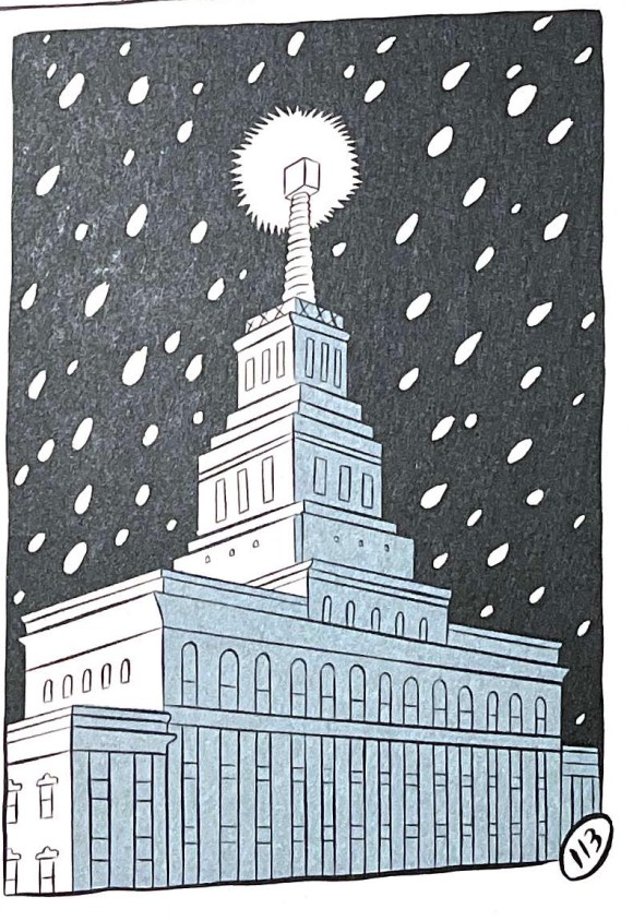
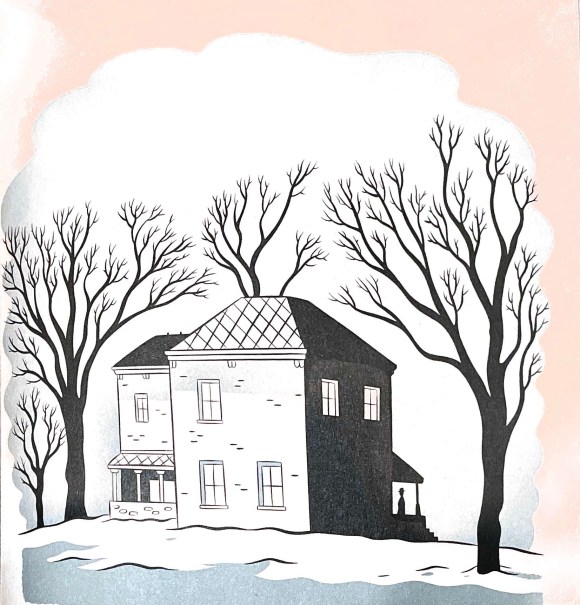
Winter? Which cartoonist leads us into winter best?
SETH.
The drawings in Seth’s classic winter tome – It’s a Good Life, If You Don’t Weaken. depict a frigid, contemplative, Canadian winter in a variety of settings: