Lucas took it all in, reading books and comics, watching movies, filing away the bits and pieces he liked, discarding what he didn’t. “I researched kids’ movies and how they work and how myths work,” Lucas said, “and I looked very carefully at the elements of films within that fairy tale genre which made them successful. I found that myth always took place over the hill, in some exotic, far off land. For the Greeks, it was Ulysses going off into the unknown. For America it was out West. . . . The last place left ‘over the hill’ is space.”
May the Fourth be with you.
Jones, Brian Jay. George Lucas: A Life. United States, Little, Brown, 2016. pp179
The trunk of an elephant might feel cool to the touch. Not what one expects, perhaps, from 200 pounds of writhing muscle, strong enough to uproot a tree, which tapers down to two “fingers,” giving it enough delicacy to detect the ripest berry on a shrub, and pluck it. Feeling an elephant’s trunk draws you to her other great feature: melancholic eyes that are veiled by long and dusty lashes. This combination of might with the suggestion of serene contemplation is surely the reason that elephants seem to embody a special state of grace.
I appreciate this description of an elephant’s trunk. It’s a surprising, captivating way to open a letter. Note the focus, the detail. Wang could have described the entire elephant, but instead he honed in on one appendage.
Good writing is specific.
Also, he recounts this admonition about learning he wrote in his 2017 letter.
“Knowledge can compound. I’d like for us to think more about how to accelerate the growth of learning. The traditional method of reading more books and trying to improve professionally are good starts, but it’s not enough to stop there. One can learn more by traveling to new places, being social in different ways, reading new types of books, changing jobs or professions, moving to a new place, by doing better and by doing more.”
– Dan Wang
Learning can compound.
Dan’s letters are beyond bookmarking. They are worth printing out and reading in hand.
Alright. This is the DC comics edition. As I was looking these over, I thought what’s the purpose of comics lettering?
My theory is comic book cover lettering needs to “anchor” the cover. It will be the one piece of comic book graphic design that remains the same issue after issue.
The cover art will change, but the title lettering (typically) stays consistent. Comic covers are displayed cover out on spinner racks (R.I.P.) and comic book stores. Good title lettering should immediately reveal who the hero(s) are and what type of adventure you’re in for.
Let’s take a closer look.
Tales of the Teen Titans #63, 1986
Before they were a hit cartoon, The Teen Titans were a superhero group with an ongoing series. Think the mini version of the Justice League.
DC kept their wordmark recognizable for this special Tales of the Teen Titans series by keeping the same font from their 80’s title The New Teen Titans. They did switch the color from red to blue. But it remains a font that coveys strength of the team as a group.
All Star Squadron #28, 1983
The whack Justice League deserves it’s due. It follows a common trend of comic book title lettering, using red and 3D block letters. But it works in three pieces of contrast as well.
ALL is flat and lifted forward with the a white star behind it.
STAR is the largest of the font sizes and has the thickest stroke around the letters.
SQUADRON is slightly smaller and has a star inside the A. Also, the stroke thins out.
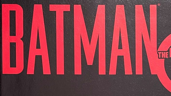
Batman The 10 Cent Adventure, 2002
There’s hundreds of variations of Batman covering lettering. The lettering for the one-off, 10 cent adventure has tall, blood red, san-serif font. The design foreshadows the story of Bruce Wayne being framed for murder.
Starman #13, 1989
One of the cheesiest superheros of all time. Has the name your friend’s little brother would think up on the playground. The lettering follows a similar trend. Red, 3D block letters. Tight kearning. And replacing a letter with a shape. In this case, a star for the A.
These are well executed examples of lettering. But it’s the feelings they evoke about the characters that makes them special.
Let’s take a closer look.
X-Men Grand Design #1, 2017
For Ed Piskor’s Grand Design, you can see the 90s influence of the X-Men cartoon show. Even though it’s paper, you can almost see the volt of electricity flowing through the letters.
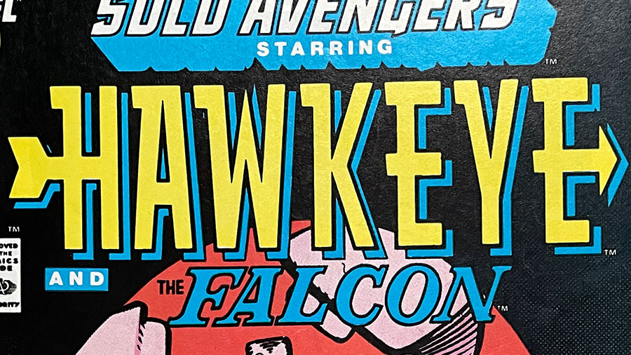
Hawkeye #6, 1988
With Hawkeye’s lettering you get the feeling that this is a hero who’s all about one thing: hitting the target.
Excalibur #3, 1988
The British X-men? Probably too many swords on this one. But it does express a royal, knights of the round table feel.
Fantastic Four #356, 1991
Slapstick. Zany. Funny. Heroic.
The Fantastic Four lettering captures all the energy of what makes the Fantastic Four adventures so well, fantastic!
Neil Gaiman’s script work on Sandman is well known. But he also drew comics for fun. Inspired by Steve Bissette’s 24-hour comic day shenanigans, Neil drew a four panel comic about his shades.
To the absolute best of your ability, create an exact replica of your favorite page. Do not trace. Any deviation from the original should be unintentional on you part; ineptitude and sloppiness are charmless when deliberate.
Cartooning: Philosophy and Practice, pg 60. Brunetti, Ivan
Brunetti then urges his students to pay close attention to each element of their comics page:
Pay close attention to what you are copying. Think about the artist’s decisions regarding page layout, panel compositions, design, characterization, dialogue, gesture, captions, balloons, word placement, sound effects, line, shape, texture, etc. Hopefully you will gain some appreciation of their working and thinking process… and the difficulty of creating a comics page.
Cartooning: Philosophy and Practice, pg 60. Brunetti, Ivan
Brunetti practiced this version of copywork in his own career.
He took on the Nancy strip for a time. The pressure from the syndicate to copy Ernie Bushmiller‘s style precisely, further developed his cartooning technique.
I can tell exactly the time period in my work when I was doing these-the syndicate were such nitpickers about me copying Bushmiller’s style exactly that my approach to cartooning got much more precise as a result. I went from doing strips just to amuse myself, without a grand plan, to focusing on formal aspects of cartooning much more: where to place a word balloon, the composition of every panel, and the flow of panels.
In the Studio: Visits with Contemporary Cartoonists, pg 279. Hignite, Tom
Brunetti enjoyed the project while in the learning phase, but admitted it was an unpleasant way to work:
When you’re copying someone else’s style exactly, you can theorize about it, and actually break it down into a set of rules. So they way I was working by imitating him had almost nothing to do with the way he was working…I also realized that working this way was totally unpleasant, because there are very strict parameters you have to follow, rather than discovering the rules that work. The project was fun while I was discovering all of the rules; I would notice that he would never put certain kind of marks next to one another because they’d look wrong. I became very aware of every penstroke, where he used a ruler, where it was freehand. He had an intuitive sense of what looked good, so for me it was trying to codify this into a set of rules, which made me realize the importance of the consistency of your cartooning vocabulary.
In the Studio: Visits with Contemporary Cartoonists, pg 279. Hignite, Tom
Could Brunetti’s copywork exercise translate into other disciplines as well?
If you’re an aspiring graphic designer you could recreate your favorite logos, stroke by stroke, in illustrator?
Or if you’re a programmer, instead of cutting and pasting, you typed out lines of code, line by line, character by character?
With thought and imagination, copywork exercises can be applied to every discipline.
I heard a theory once that the best superhero movies are the ones where the hero is on screen, in full costume, the least amount of time.
The idea being that it’s what’s happening behind the mask that is the most meaningful.
I wonder if this theory holds true on the comics page.
Bendis’ run on Ultimate Spiderman was filled with these un-cowled moments. Moments where Peter Parker experiences the power of being Spider-Man, but also the vulnerability of being human.
The Krazy Kat strip above, is “cut and stacked”. A layout method used to fit strips into different newspapers.
Krazy Kat & the Art of George Herriman: A Celebration is the best kind of book. It’s the kind of book you lose an afternoon to. You open a few pages to “have a look”, and an hour later you wonder where the time went.