Alright. This is the DC comics edition. As I was looking these over, I thought what’s the purpose of comics lettering?
My theory is comic book cover lettering needs to “anchor” the cover. It will be the one piece of comic book graphic design that remains the same issue after issue.
The cover art will change, but the title lettering (typically) stays consistent. Comic covers are displayed cover out on spinner racks (R.I.P.) and comic book stores. Good title lettering should immediately reveal who the hero(s) are and what type of adventure you’re in for.
Let’s take a closer look.

Before they were a hit cartoon, The Teen Titans were a superhero group with an ongoing series. Think the mini version of the Justice League.
DC kept their wordmark recognizable for this special Tales of the Teen Titans series by keeping the same font from their 80’s title The New Teen Titans. They did switch the color from red to blue. But it remains a font that coveys strength of the team as a group.

The whack Justice League deserves it’s due. It follows a common trend of comic book title lettering, using red and 3D block letters. But it works in three pieces of contrast as well.
- ALL is flat and lifted forward with the a white star behind it.
- STAR is the largest of the font sizes and has the thickest stroke around the letters.
- SQUADRON is slightly smaller and has a star inside the A. Also, the stroke thins out.

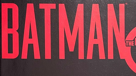
There’s hundreds of variations of Batman covering lettering. The lettering for the one-off, 10 cent adventure has tall, blood red, san-serif font. The design foreshadows the story of Bruce Wayne being framed for murder.

One of the cheesiest superheros of all time. Has the name your friend’s little brother would think up on the playground. The lettering follows a similar trend. Red, 3D block letters. Tight kearning. And replacing a letter with a shape. In this case, a star for the A.