


This post was inspired by web designer Regan Ray‘s Marvel Superhero Lettering blog post (h/t Austin Kleon). It had me wondering, what awesome lettering was in my long box?
These are well executed examples of lettering. But it’s the feelings they evoke about the characters that makes them special.
Let’s take a closer look.

For Ed Piskor’s Grand Design, you can see the 90s influence of the X-Men cartoon show. Even though it’s paper, you can almost see the volt of electricity flowing through the letters.
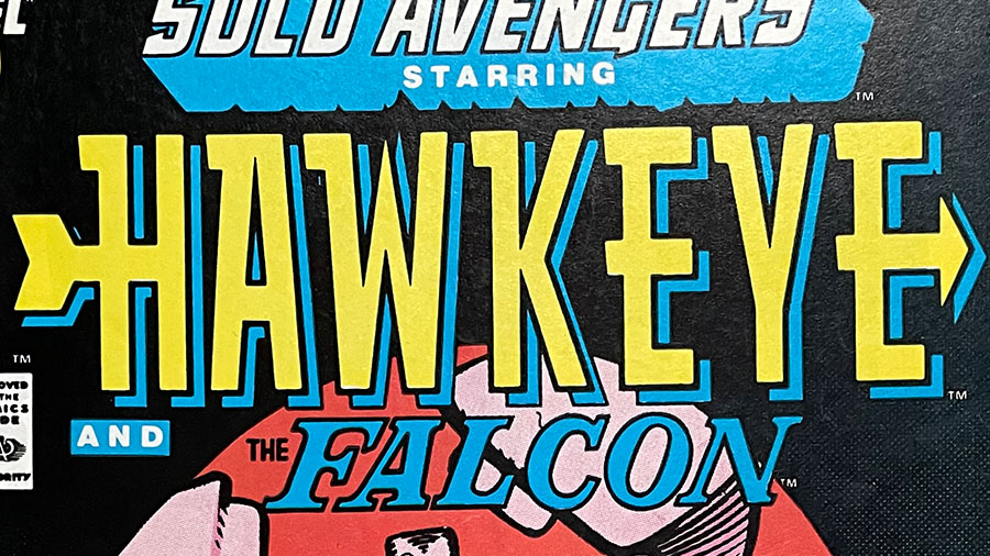
With Hawkeye’s lettering you get the feeling that this is a hero who’s all about one thing: hitting the target.

The British X-men? Probably too many swords on this one. But it does express a royal, knights of the round table feel.

Slapstick. Zany. Funny. Heroic.
The Fantastic Four lettering captures all the energy of what makes the Fantastic Four adventures so well, fantastic!
