“You got to tilt a windmill sometimes.”
– Palmer Luckey
It’s called “Planned Obsolescence” . A phrase I didn’t know existed. It’s the number one killer of great products every year.
This is for all the super hardcore turbo nerds out there.
An online commonplace book
“You got to tilt a windmill sometimes.”
– Palmer Luckey
It’s called “Planned Obsolescence” . A phrase I didn’t know existed. It’s the number one killer of great products every year.
This is for all the super hardcore turbo nerds out there.
“Sneakers are for doing stuff”
– Tom Sachs
I haven’t been this hyped for a pair of sneakers in ages. Honestly it’s the story, this seventeen minute video that turned the dial. The Mars Yard aren’t Marty McFly’s Mags or Jordan 11s. But like Jordans they have that feel of “If I only had a pair I could be a full time, famous artist, in Manhattan.
Inspired by the vanishing subgenre of agricultural memo books, ornate pocket ledgers, and the simple, unassuming beauty of a well-crafted grocery list, the Draplin Design Co., Portland, Ore. – in conjunction with Cloudal Partners, Chicago, Ill. – brings you “FIELD NOTES‘ in hopes of offering “An honest memo book worth fillin’ up with GOOD INFORMATION.”
Wow. That is a long sentence.
This from the inside back cover of any Field Notes memo book.
Fun marketing that makes you feel like a ranch hand, lone-ranger, or early 19th century boxing correspondent.
He has indeed made many different kinds of lines. An art historian could put together a chronology of his career just in terms of the multiplicity of diverse lines that he has produced. In the late 1960s and early 1970s, for example, there were the ultra-thin marks made by a kind of pen called a Rapidograph, with which he created drawings modelled with line alone — no shadows. Then, quite different, the works in coloured crayon and pencil of the early 1970s; the chunkier reed-pen strokes of portraits from the end of the decade, such as the poignant one of his mother done just after his father died in February 1979 ( not 1978, the date inscribed on the drawing); the later ones drawn with a brush, including watercolours from 2003; the extraordinary charcoal landscapes of the Arrival of Spring 2013; and on and on.
– Martin Gayford
A career life in lines sounds like a good one to aspire to.
Gayford, Martin, and Hockney, David. Spring Cannot Be Cancelled: David Hockney in Normandy. United Kingdom, Thames & Hudson, 2021. pp83
On the lessons of chess. Sport could apply here too. Any competitive activity really…
Rick Rubin: As you were progressing, as things were going good, as you were rising in whatever ranks there were, do you remember a big loss?
Tyler Cowen: Well, what I remember most, is I learned pretty early on. This was very important for me. Like first I learned I could win. Beat like grown adults. But more importantly I learned that I could lose. That there were people out there who were just better than I was. And even if sometimes I’d hold even because I had good work habits or I didn’t take drugs or drink, like they were just better. And a lot of smart young people don’t learn that until much later, and that they’re not sort of built to adjust for it. And I feel I was built to adjust for that very early on. So I always knew there would be smarter people than me out there, and to do well I would have to kind of have rituals and routines, where I would have a lot of compound learning, and just keep on doing those for many decades. And that I figured out when I was like twelve, thirteen because of chess. And that was just invaluable for me.
Excellent throughout. One of the best podcasts I’ve ever listened to. The tone of voice. The steady pace. Rick Rubin channeling his inner Tyler Cowen with ping-ping-ping questions. The range of topics, getting into Tyler’s childhood, his fascination with music, chess, global population, Rick asked questions of Tyler that haven’t been asked before. Wonderful.
Pair with the D.J. Tyler Cowen bonus episode.
These pamphlets in Wes Anderson’s Criterion Collections are worth the price of admission. They’re filled with drawings, interviews, and behind- the-scenes insights. An analog version of a blu-ray’s bonus features.
Here Wes shares a glimpse of his process:
When I’m writing, I keep notebooks of my ideas for sets, props, and clothes. I incorporate some of these ideas into the script, but I set the majority of them aside to give privately to the different department heads during preproduction. In the past, I have occasionally forgotten some of my favorite ideas until it was too late – – for example, after the movie is out on video. To prevent this from happening on THE ROYAL TENENBAUMS (which contains more perhaps unnecessary visual detail than both my previous films combined), about three months before we started shooting, I asked my brother Eric, a skilled illustrator, to help me create a set of drawings that would include much of the information I wanted to communicate to the crew — and that would also suggest the overall look and feeling of the movie.
We had already found the house where I wanted to film (in the Hamilton Heights section of Harlem), and our production designer, David Wasco, had provided us with a set of blueprints, so I was able to very specifically plan the contents and arrangements of each of the rooms, and Eric was able to meticulously render them. Eric was, in fact, so meticulous that many of the sets had already been constructed by the time he finished the drawings. Eventually, however, his illustrations became the standard equipment on the walls of the production offices and art department and in the notebooks of everyone on the crew — a sort of manual to keep next to your script. We include a copy here for you.
— Wes Anderson
Criterion Collection Pamphlet. The Royal Tenenbaums
Eric Chase Anderson is underrated.
Is Wes Anderson the filmmaker with the highest percentage of his movies in the Criterion Collection? 9 from 10? I’m sure the French Dispatch is lurking at the door.
JEAN JULLIEN: Can you remember when I first started to draw?
SYLVIE JULLIEN: As far as I’m concerned, you’ve always drawn. You’ve been doing it ever since you were able to pick up a pencil. You didn’t “learn”
BRUNO JULLIEN: You drew all the time, even on tablecloths when we were out at restaurants. It was your way of expressing yourself, of describing the tiniest routine events. You did this in sketchbooks that you would carry around with you, the ones we would offer you regularly. It was a ritual.
JJ: Yes, you gave me my first sketchbook. When I was at school in Quimper (a city in northwest France), my teacher Jacques Vincent encouraged us to keep a journal. There wasn’t much in the way of rules; the idea was to get us to draw and draw and draw so that we developed a visual language. And what better way to do that than to look for inspiration in what is around you? I think that my practice of drawing every day and my interest in everyday life come from that exercise.
Jullien, Jean. Jean Jullien. New York: Phaidon Press Inc, 2022. (see page 35)
Having Jean Jullien’s parents share his drawing origin story is a wonderful approach. Our origin stories must look different to our parents, who if they were around, watched them manifest in real time.
The idea of keeping a drawing journal seems beneficial for developing your own visual language. Your own style.
Keep drawing.
Bruce Mau? Before yesterday, never heard of him. To only call him a graphic designer would be a disservice.
Apparently he’s redesigned entire countries?
Has ideas on diplomacy?
Written or designed more than 250 books?
On our watch list.
H/T: Monster Children
Designers in the shadows
There are famous graphic designers. Paula Shuere. David Carson. Chip Kidd and Saul Bass. But most graphic designers toil and create in the shadows. The majority of the design pieces we profiled did not have a designer attributed to them. This was a surprise. We thought a simple google search, or look on a company’s “about us” page would accredit a designer to their public image.
Not true.
For such a public art form, the majority of the artists are unknown.
Below are the few graphic designers we could attribute designs to:
Topo Chico – Guicho Romero.
Fiesta Mart – R. Ruiz
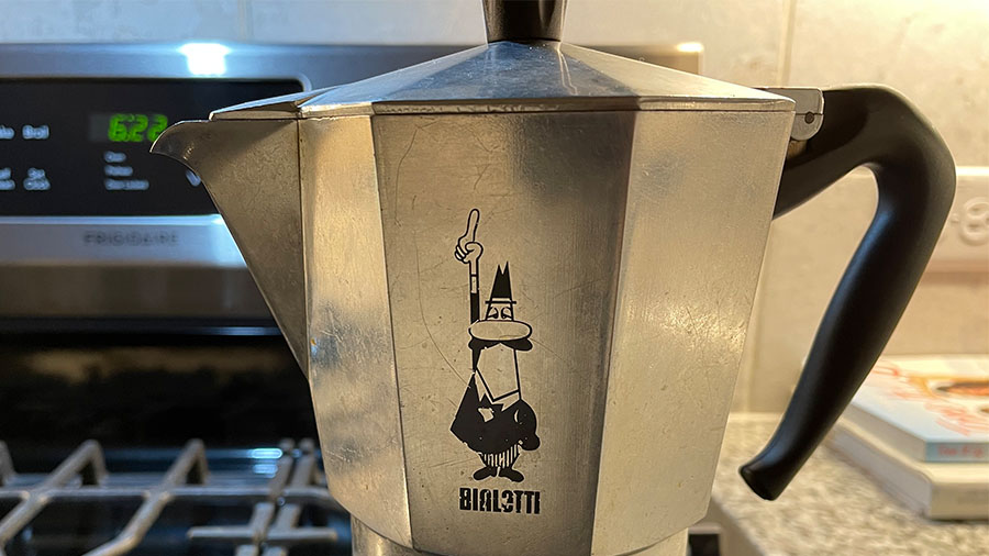
Bialetti – Paolo “Paul” Campani
LAFC – Matthew Wolff
EPCOT font – Deborah Lord
Volkswagen – Franz Xaver Reimspiess
Contrast is king
Plain to italic.
Bold to normal.
Light to dark.
ALL CAPS to Proper-Case.
Contrast is the king of graphic design fundamentals. It draws attention to the design. It helps communicates the message. Contrast acts like a visual speed bump. It’s a quick change in weight that slows our eyes down and grabs our attention.
See this Hyper Bike Company typeface:
Notes on typography
Typography can stand alone as a discipline. A few typography notes to remember:
Leading – the distance between lines of type. Leading is measured in points.
Kerning – is the space between letters.
Serif = little feet.
Sans Serif = no little feet.
This EPCOT signage from the France Pavillion, combines serif and sans-serif lettering:

Wide kerning is used to convey elegance.
See the bottom Market & Bakery typeface on this Eatzi’s sign:

Conclusion
Observing graphic design changes your view of the world. Every sign, every book or magazine cover, every piece of packaging you hold takes on a new meaning.
The typography, the logo, the color palette, the layout, it’s there on purpose. It’s there to guide your eye. To nudge you towards one product over another, to make you feel something. To direct you to safety. To implore you to risk.
Looking closely at any piece of graphic design will take your life off of autopilot, and that’s worth the time.
Helpful Resources:
Go: A Kidd’s Guide to Graphic Design by Chip Kidd
Earthquakes, Mudslides, Fires & Riots: California and Graphic Design, 1936–1986, by Louise Sandhaus
Seth’s Blog – Avoid the clown suit. How to get better at graphic design…
Will Paterson’s YouTube Channel:
