Handwriting, penmanship, this is all drawing. Hand-lettering can be another artistic tool to add to your kit.
Matthew Frederick shares 6 architectural hand-lettering principals to follow:
1. Honor legibility and consistency above all else.
2. Use guide lines (actual or imagined) to ensure uniformity.
3. Emphasize the beginning and end of all strokes, and overlap them slightly where they meet – just as in drawing lines.
4. Give your horizontal strokes a slight upward tilt. If they slope downward, your letters will look tired.
5. Give curved strokes a balloon-like fullness.
6. Give careful attention to the amount of white space between letters. An E, for example, will need more space when following an I than when coming after an S or T.
Matthew Frederick
This week, for fun, find ways to practice your architectural hand-lettering.
Write a thank-you note.
Write a love letter.
Write a haiku.
Then mail it out it to your lover, mother, or bestie.
Be sure to practice your hand-lettering on the to and from address on the envelope as well.
You’ll get some practice in, and they will receive a special gift.
By drawing. By drawing cartoons. Before I could read or write I used to draw comics at school and at home. The funny thing is that I now realize that when I was in high school I had the reputation of being a writer, though I never in fact wrote anything. If there was a pamphlet to be written or a letter of petition, I was the one to do it because I was supposedly the writer. When I entered college I happened to have a very good literary background in general, considerably above the average of my friends. At the university in Bogotá, I started making new friends and acquaintances, who introduced me to contemporary writers. One night a friend lent me a book of short stories by Franz Kafka. I went back to the pension where I was staying and began to read The Metamorphosis. The first line almost knocked me off the bed. I was so surprised. The first line reads, “As Gregor Samsa awoke that morning from uneasy dreams, he found himself transformed in his bed into a gigantic insect. . . .” When I read the line I thought to myself that I didn’t know anyone was allowed to write things like that. If I had known, I would have started writing a long time ago. So I immediately started writing short stories. They are totally intellectual short stories because I was writing them on the basis of my literary experience and had not yet found the link between literature and life. The stories were published in the literary supplement of the newspaper El Espectador in Bogotá and they did have a certain success at the time—probably because nobody in Colombia was writing intellectual short stories. What was being written then was mostly about life in the countryside and social life. When I wrote my first short stories I was told they had Joycean influences.
Of course, Gabriel García Márquez’s writer’s origin story begins with drawing cartoons.
What is it about drawing that fuels other creative pursuits?
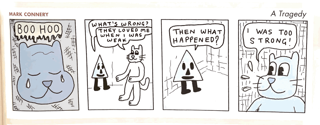
Connery, a Torontonian, has been producing his minis and comics himself, distributing them through the mail or anonymously dropping copies at punk shows, libraries, and on public transit, leaving a portion of his readership up to the vagaries of fate. Very punk indeed.
Every drawing you undertake has a hierarchy. There are the general elements. And there are the fine details.
Matthew Frederick recommends laying out the entire drawing to start.
How?
By making use of:
Light guide lines.
Geometric alignments.
Visual gut-checks.
These techniques will help ensure the proportions and placement of shapes are accurate.
After that hit the details. But don’t over indulge in one place:
When you achieve some success at this schematic level, move to the next level of detail. If you find yourself focusing on details in a specific area of the drawing, indulge briefly, then move to other areas of the drawing.