So Morris is taking the old tales and allowing us to connect back. But he’s not shouting at us ever. And often I think activism is associated with people getting angry, people getting fraught and strident and he’s never those things. He focuses on the positive.
Speaking of medieval color excess and impractical decoration, let me remind you that William Morris was peak. pic.twitter.com/AhikBLxzZz
Fascinating how when you read about specific people and subjects, similar subject and people pop up and intertwine from other places.
William Morris was one of Penelope Fitzgerald’s heroes. He’s mentioned often in her biography. And then scrolling twitter and bam! This wonderful video, two minutes of William Morris joy.
Inspired by the vanishing subgenre of agricultural memo books, ornate pocket ledgers, and the simple, unassuming beauty of a well-crafted grocery list, the Draplin Design Co., Portland, Ore. – in conjunction with Cloudal Partners, Chicago, Ill. – brings you “FIELD NOTES‘ in hopes of offering “An honest memo book worth fillin’ up with GOOD INFORMATION.”
Wow. That is a long sentence.
This from the inside back cover of any Field Notes memo book.
Fun marketing that makes you feel like a ranch hand, lone-ranger, or early 19th century boxing correspondent.
Don’t fret. I didn’t know what the Summit Series was either. It was an eight game hockey series between Canada and the Soviet Union. This was the first time NHL players filled the Canadian national team roster.
On the surface 1972 looks like a hockey book, but as I read on I discovered it’s a Canadian history book. It’s packed with historical moments most non-Canadians would know nothing of.
See the FLQ crisis. Crisis of national identity is not something unique to the last five years.
There are famous graphic designers. Paula Shuere. David Carson. Chip Kidd and Saul Bass. But most graphic designers toil and create in the shadows. The majority of the design pieces we profiled did not have a designer attributed to them. This was a surprise. We thought a simple google search, or look on a company’s “about us” page would accredit a designer to their public image.
Not true.
For such a public art form, the majority of the artists are unknown.
Paolo “Paul” Campani – One of the few known designers
Below are the few graphic designers we could attribute designs to:
Contrast is the king of graphic design fundamentals. It draws attention to the design. It helps communicates the message. Contrast acts like a visual speed bump. It’s a quick change in weight that slows our eyes down and grabs our attention.
See this Hyper Bike Company typeface:
Thick to thin typeface
Notes on typography
Typography can stand alone as a discipline. A few typography notes to remember:
Leading – the distance between lines of type. Leading is measured in points.
Kerning – is the space between letters.
Serif = little feet.
Sans Serif = no little feet.
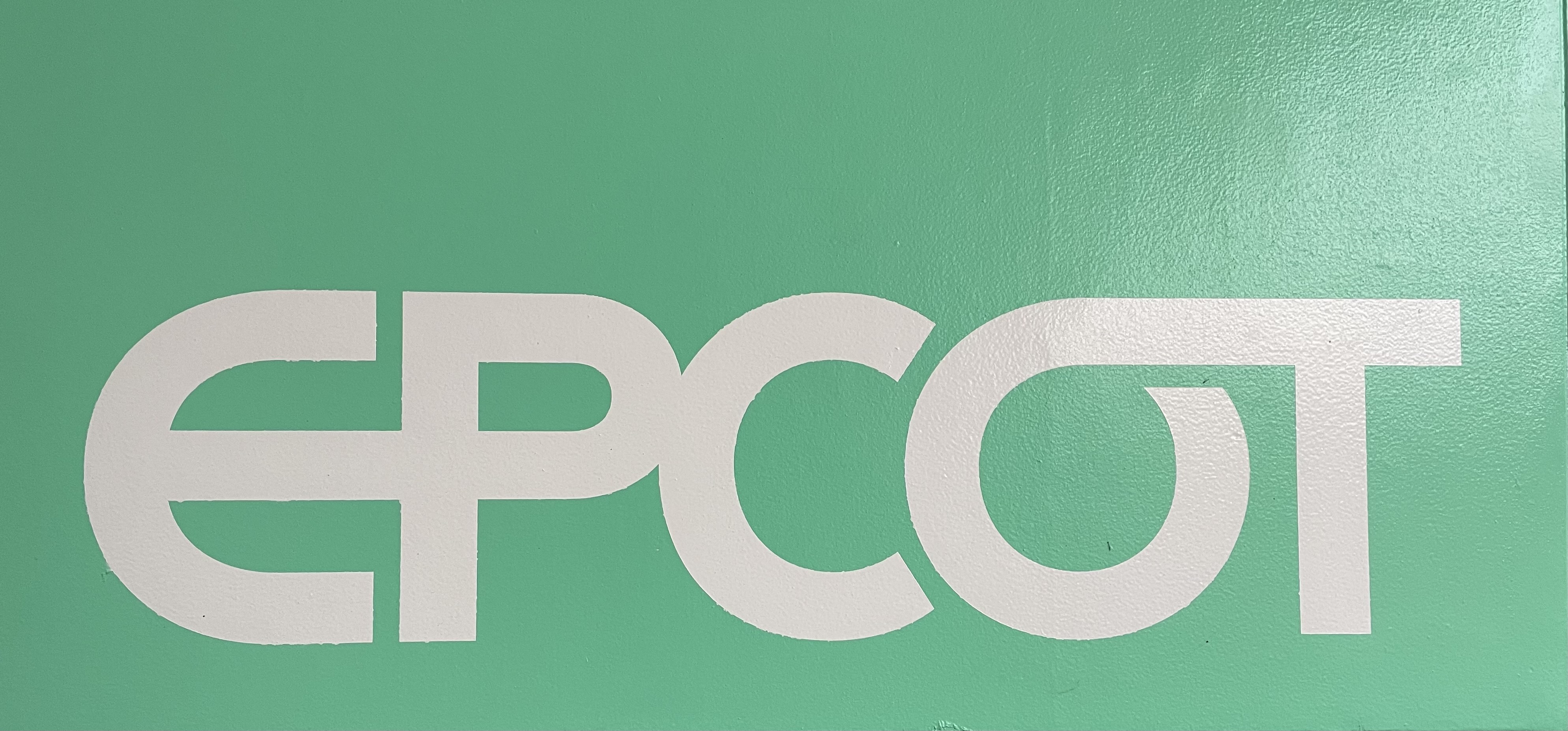
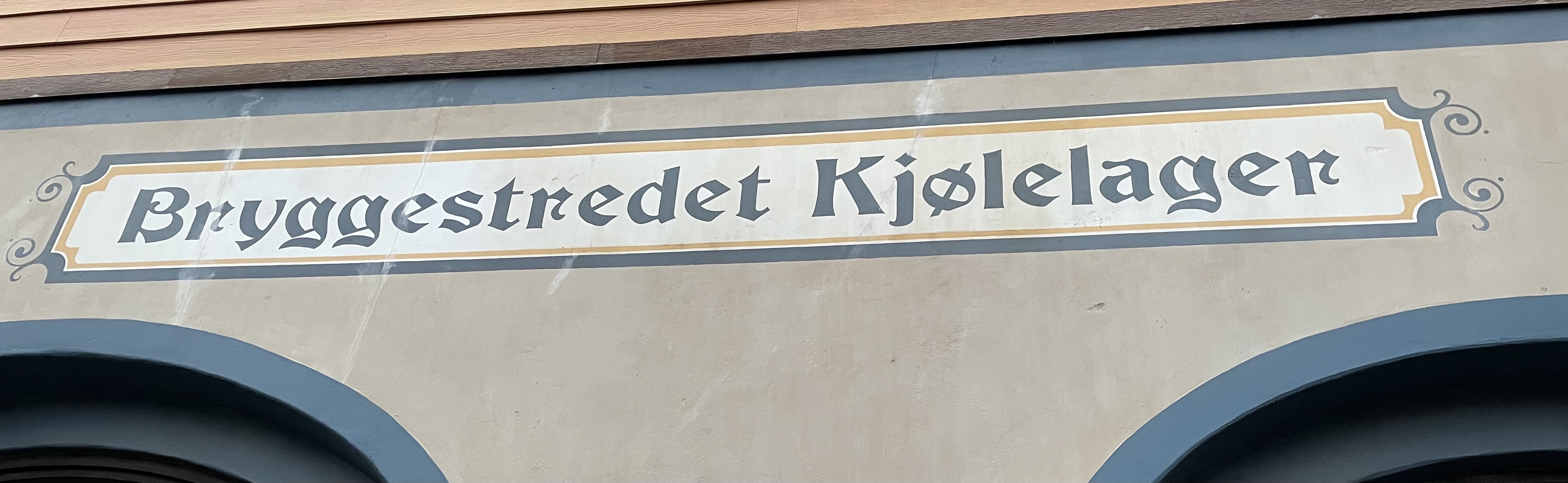
This EPCOT signage from the France Pavillion, combines serif and sans-serif lettering:
Serif on the top. Sans-serif below.
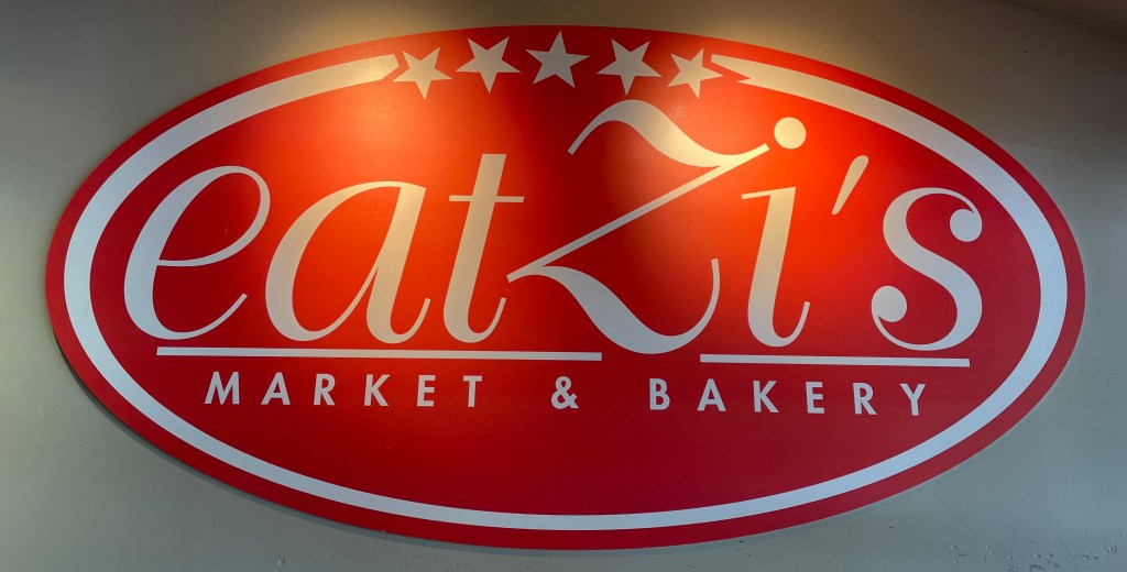
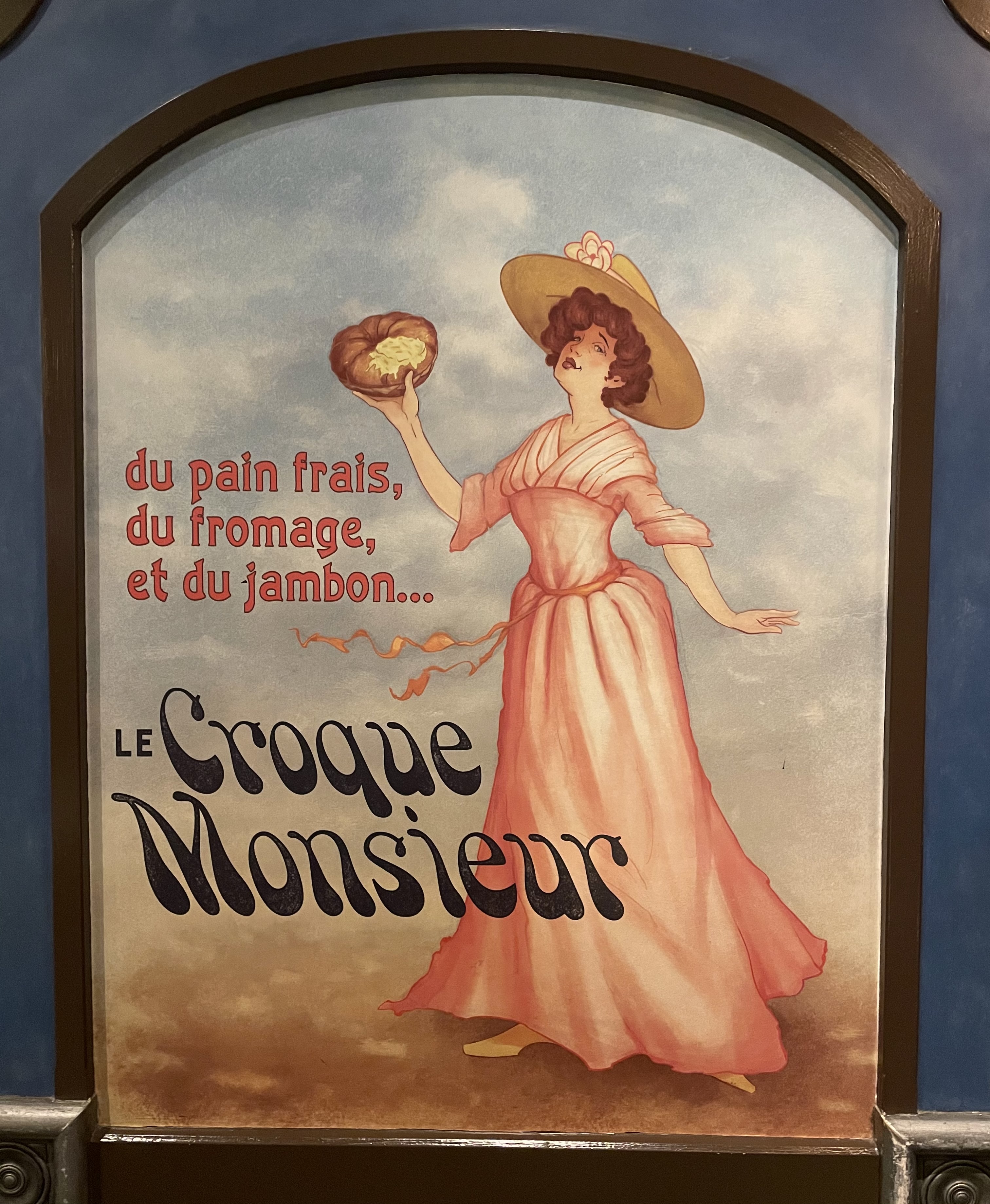
Wide kerning is used to convey elegance.
See the bottom Market & Bakery typeface on this Eatzi’s sign:
Wide kerning for contrast and elegance
Conclusion
Observing graphic design changes your view of the world. Every sign, every book or magazine cover, every piece of packaging you hold takes on a new meaning.
The typography, the logo, the color palette, the layout, it’s there on purpose. It’s there to guide your eye. To nudge you towards one product over another, to make you feel something. To direct you to safety. To implore you to risk.
Looking closely at any piece of graphic design will take your life off of autopilot, and that’s worth the time.
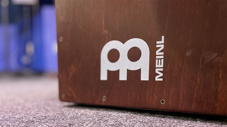
Meinl is a German percussion company headquartered in Gutenstetten.
Today, Meinl is a known brand amongst American drummers and percussionists, but this wasn’t always true. A strategic Reinhold Meinl led branding effort in the 80s lifted the brand into the global consciousness.
The thick circles introduce the drum and cymbal theme. The “legs” establish the M. The simple shapes keep the logo familiar in any color. The simple shapes and thick lines makes the Meinl logo noticeable from a distance on any cymbal, drum case, amplifier, or band van.
Hero typewriters are a Chinese typewriter brand. Originally known as the Flying Fish PSQ, they were rebranded Hero in the 1980s. The logo’s designer, like many of these we’ve profiled in this series, is unknown (if you know please reach out.)
The Hero logo stands out because of its variety of shapes.
There’s the rectangle that frames the “ero”.
The “H” which looks like a small person finishing their morning stretches has four shapes – the “H”, the arm cubes, the small house shaped silhouette inside the arm cubes, and the vertical space-bars on each side of the “H”.
Finally the oval pulls all the shapes together and gives them a structure to live.
The designer also incorporated Chinese characters and English letters. One could assume this is the word “Hero” written in Chinese, but no need to assume here. Incorporating two languages and two typefaces in one logo is a rare graphic design feat.
For all you typewriter junkies out there check out these two additional articles on Hero typewriters:
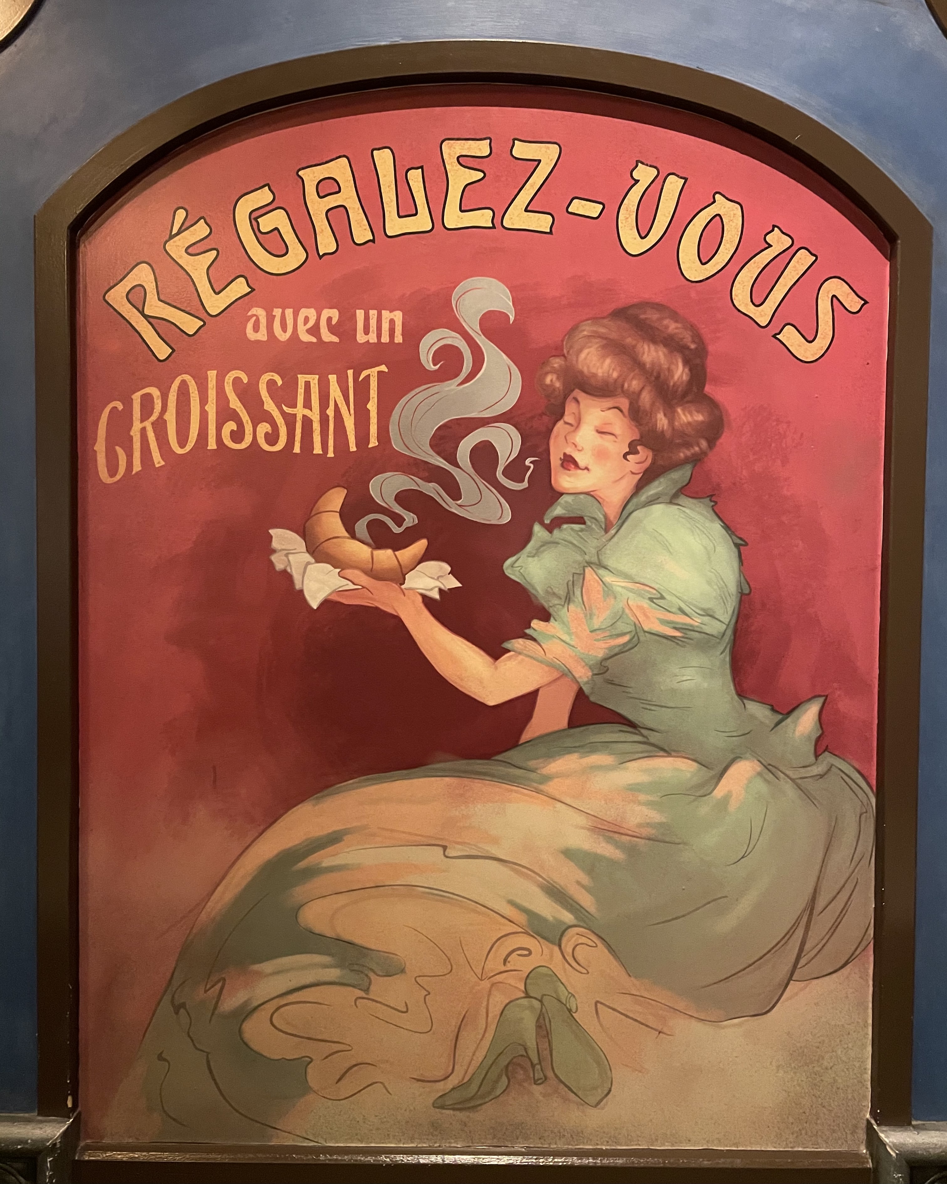
EPCOT opened October 1, 1982. The Experimental Prototype Community of Tomorrow was Walt’s hope for the future of urban design. Alas Walt’s true urban design vision wasn’t realized, but the park remains a graphic design menagerie.
With every step you’re surrounded by typography, logos, icons, poster designs, and signage.
Again, graphic design plays an important role in creating imaginary worlds. EPCOT is no different. The stronger the graphic design, the more realistic the imaginary world around you feels.
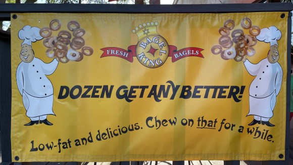
Bagel King first appeared in Central Florida in 1977. The founders, Frank and Tina Perrotta opened the first location was in Winter Park. Their mission? Delight customers with NY style bagels.
Problem was, many Winter Park residents in 1977 didn’t know what a bagel was. But the local Jewish community spread the word and boom! 44 years later Bagel King is still thriving.
Their logo, “the royal bagel” we’ll call it, does have an early 90s clip-art feel. The Star of David on the crown, harkens back to Bagel King’s New York roots. But that’s all part of its charm. Bagel King doesn’t need some modern logo to validate it. Its logo, and it’s bagels get the job done.
Thunderbird Roller Rink is a North Texas institution.
The Plano location first opened in 1972, and we for one, are glad they kept the original exterior Thunderbird logo.
The best logos work well in any context. This 8-bit thunderbird looks as bold and clear on the front wall of the skating ring, as it does scaled down on their website.