Meinl is a German percussion company headquartered in Gutenstetten.
Today, Meinl is a known brand amongst American drummers and percussionists, but this wasn’t always true. A strategic Reinhold Meinl led branding effort in the 80s lifted the brand into the global consciousness.
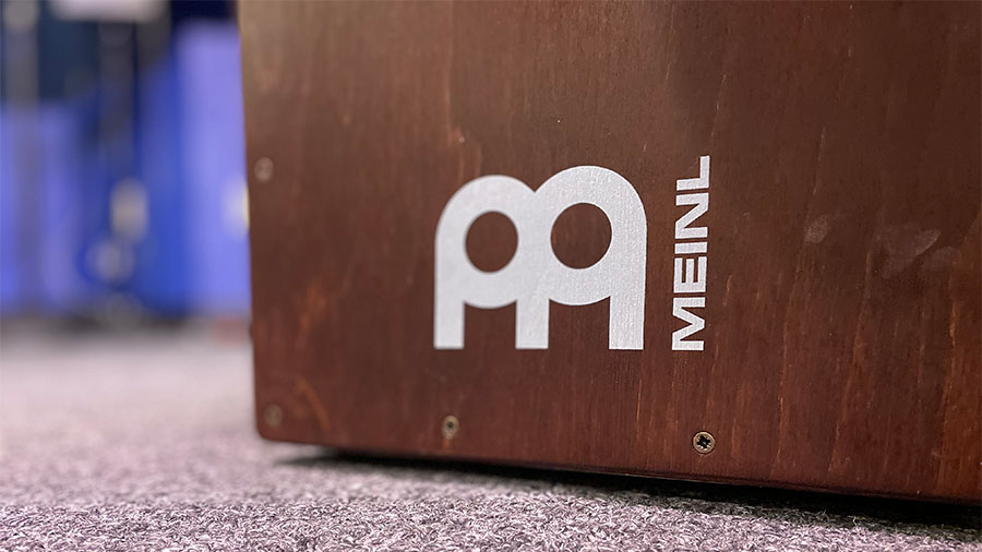
Part of any branding exercise includes logo design. The Meinl logo is instantly recognizable, but the logo’s meaning has been interpreted differently. Some have said it’s PA. Others say it’s an M with an R for Rolan Meinl. We’ll go with DRUM! Magazine’s interpretation – it’s an M.
The thick circles introduce the drum and cymbal theme. The “legs” establish the M. The simple shapes keep the logo familiar in any color. The simple shapes and thick lines makes the Meinl logo noticeable from a distance on any cymbal, drum case, amplifier, or band van.
The designer is not listed.
Steely Determination: DRUM! Visits The Meinl Factory, DRUM! Magazine
