Quickly I had learned that in the high Antarctic where I worked, besides the books, a knife to sharpen my pencil was indispensable, any ink in a pen usually freezing. And any sort of electronic device just would not work, and would be unreliable. I also learned, from some anxious experiences, that a field book had to become ‘un-losable’. Starting out, I once mislaid a book when trying to capture a skua with a net; it was often an athletic endeavor, with a bird diving one way, and my book flying out of my parka pocket in the other. Only after painstakingly retracing my steps was I able to recover it, its brown cover camouflaged among the endless boulders and frozen guano of the penguin colony. It was a huge relief – you can’t imagine how happy I was. Thereafter I would plaster the journals with bright yellow tape in fat stripes. Eventually I found field books bound in vivid orange covers. In the polar snows, these were just perfect.
It’s hard to convey to a young fan raised in an age of streaming how much we listened over and over again to the same records back in those days. Most of us couldn’t afford to buy many albums, so the ones we did own got lots of use. Even records I didn’t enjoy got second chances—and third chances and fourth chances, and so on—to win my allegiance. To reject an album after you bought it was like writing off a capital investment.
There are famous graphic designers. Paula Shuere. David Carson. Chip Kidd and Saul Bass. But most graphic designers toil and create in the shadows. The majority of the design pieces we profiled did not have a designer attributed to them. This was a surprise. We thought a simple google search, or look on a company’s “about us” page would accredit a designer to their public image.
Not true.
For such a public art form, the majority of the artists are unknown.
Paolo “Paul” Campani – One of the few known designers
Below are the few graphic designers we could attribute designs to:
Contrast is the king of graphic design fundamentals. It draws attention to the design. It helps communicates the message. Contrast acts like a visual speed bump. It’s a quick change in weight that slows our eyes down and grabs our attention.
See this Hyper Bike Company typeface:
Thick to thin typeface
Notes on typography
Typography can stand alone as a discipline. A few typography notes to remember:
Leading – the distance between lines of type. Leading is measured in points.
Kerning – is the space between letters.
Serif = little feet.
Sans Serif = no little feet.
This EPCOT signage from the France Pavillion, combines serif and sans-serif lettering:
Serif on the top. Sans-serif below.
Wide kerning is used to convey elegance.
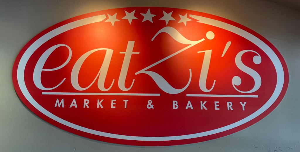
See the bottom Market & Bakery typeface on this Eatzi’s sign:
Wide kerning for contrast and elegance
Conclusion
Observing graphic design changes your view of the world. Every sign, every book or magazine cover, every piece of packaging you hold takes on a new meaning.
The typography, the logo, the color palette, the layout, it’s there on purpose. It’s there to guide your eye. To nudge you towards one product over another, to make you feel something. To direct you to safety. To implore you to risk.
Looking closely at any piece of graphic design will take your life off of autopilot, and that’s worth the time.
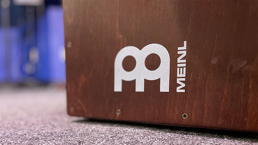
Meinl is a German percussion company headquartered in Gutenstetten.
Today, Meinl is a known brand amongst American drummers and percussionists, but this wasn’t always true. A strategic Reinhold Meinl led branding effort in the 80s lifted the brand into the global consciousness.
The thick circles introduce the drum and cymbal theme. The “legs” establish the M. The simple shapes keep the logo familiar in any color. The simple shapes and thick lines makes the Meinl logo noticeable from a distance on any cymbal, drum case, amplifier, or band van.
Hero typewriters are a Chinese typewriter brand. Originally known as the Flying Fish PSQ, they were rebranded Hero in the 1980s. The logo’s designer, like many of these we’ve profiled in this series, is unknown (if you know please reach out.)
The Hero logo stands out because of its variety of shapes.
There’s the rectangle that frames the “ero”.
The “H” which looks like a small person finishing their morning stretches has four shapes – the “H”, the arm cubes, the small house shaped silhouette inside the arm cubes, and the vertical space-bars on each side of the “H”.
Finally the oval pulls all the shapes together and gives them a structure to live.
The designer also incorporated Chinese characters and English letters. One could assume this is the word “Hero” written in Chinese, but no need to assume here. Incorporating two languages and two typefaces in one logo is a rare graphic design feat.
For all you typewriter junkies out there check out these two additional articles on Hero typewriters:
What I like about Starks is that he’s willing to fight. He got kicked outta college for stealing some kid’s stereo equipment. Then he went to another college and got kicked out for smoking weed in his dorm room and listening to rap. He worked at a grocery store while averaging eleven points per game at one college, and then went to another. He didn’t even get drafted. Had to work his way up to the NBA through the minor leagues, where they pay you next to nothing. And now, here he is. He’s the quintessential New York player. He has the city’s architecture built directly into his style of play. He endures, and it isn’t romantic. It’s peppered with drugs and theft and jail time. But if there’s a fight to be had, you want him next to you.
You have to stop thinking about anything other than what happened when you were a little kid, and you laid on the floor, and you drew. And you lost yourself in that drawing. And in the end, you absolutely loved that drawing because you made it yourself. And the drawing got hung up on the fridge regardless of how good it was, because your mom loves you and everybody loves you. Why can’t you be that kind to yourself?
Jeff Tweedy‘s book, How to Write One Song, applies to anyone who makes things. Music is the medium he reflects on, but when you read the book, swap the word “song” with anything you make – paintings, birdhouses, stock cars, stained glass windows.
I listened to The Love Movement longingly on a school bus in the early fall in Ohio, where the leaves began to fight against their inevitable departure. By the tree that hung over my bus stop, the leaves slowly began to gather around the tree’s base, as if to say We did our best. We’ll try again next time.
In a great autumnal avalanche of maple, sycamore, oak, elm leaf they hissed and rustled, fell in a shower of horse-chestnut, thumped like winter apples on the earth, with an over-all scent of farewell – summer on the wind they made in their rushing.
New York in November really does have a special charm to it. The air is clean and crisp, and the leaves on the trees in Central Park are just beginning to turn golden. The sky is so clear you can see forever, and the skyscrapers lavishly reflect the sun’s rays. You feel you can keep walking one block after another without end. Expensive cashmere coats fill the windows at Bergdorf Goodman, and the streets are filled with the delicious smell of roasted pretzels.”
This passage feels like your jogging through New York alongside Haruki Murakami. What strikes me here is how he contrasts the natural (trees, air, sun) with the man-made (Bergdorf Goodman, skyscrapers, roasted pretzels).