Designers in the shadows
There are famous graphic designers. Paula Shuere. David Carson. Chip Kidd and Saul Bass. But most graphic designers toil and create in the shadows. The majority of the design pieces we profiled did not have a designer attributed to them. This was a surprise. We thought a simple google search, or look on a company’s “about us” page would accredit a designer to their public image.
Not true.
For such a public art form, the majority of the artists are unknown.
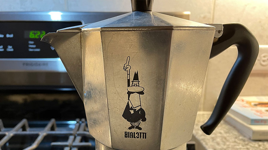
Below are the few graphic designers we could attribute designs to:
Topo Chico – Guicho Romero.
Fiesta Mart – R. Ruiz
Bialetti – Paolo “Paul” Campani
LAFC – Matthew Wolff
EPCOT font – Deborah Lord
Volkswagen – Franz Xaver Reimspiess
Contrast is king
Plain to italic.
Bold to normal.
Light to dark.
ALL CAPS to Proper-Case.
Contrast is the king of graphic design fundamentals. It draws attention to the design. It helps communicates the message. Contrast acts like a visual speed bump. It’s a quick change in weight that slows our eyes down and grabs our attention.
See this Hyper Bike Company typeface:
Notes on typography
Typography can stand alone as a discipline. A few typography notes to remember:
Leading – the distance between lines of type. Leading is measured in points.
Kerning – is the space between letters.
Serif = little feet.
Sans Serif = no little feet.
This EPCOT signage from the France Pavillion, combines serif and sans-serif lettering:

Wide kerning is used to convey elegance.
See the bottom Market & Bakery typeface on this Eatzi’s sign:

Conclusion
Observing graphic design changes your view of the world. Every sign, every book or magazine cover, every piece of packaging you hold takes on a new meaning.
The typography, the logo, the color palette, the layout, it’s there on purpose. It’s there to guide your eye. To nudge you towards one product over another, to make you feel something. To direct you to safety. To implore you to risk.
Looking closely at any piece of graphic design will take your life off of autopilot, and that’s worth the time.
Helpful Resources:
Go: A Kidd’s Guide to Graphic Design by Chip Kidd
Earthquakes, Mudslides, Fires & Riots: California and Graphic Design, 1936–1986, by Louise Sandhaus
Seth’s Blog – Avoid the clown suit. How to get better at graphic design…
Will Paterson’s YouTube Channel: