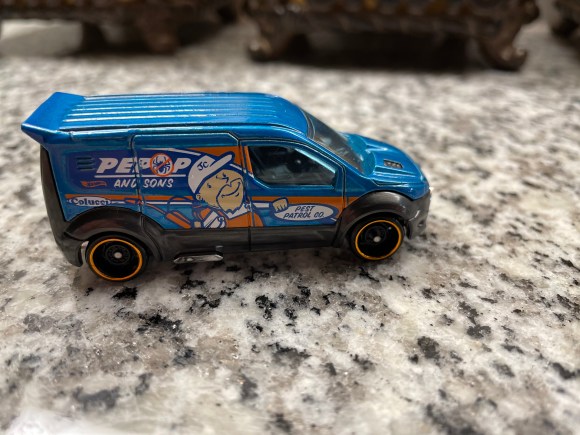
Pepop and Sons was founded in 1985 by Herman Pepop and….
<INSERT RECORD SCRATCH SOUND HERE>
Ok. Not true.
Pepop and Sons is not a real company. But even imaginary companies need graphic design work done. A blank Hot Wheel service technician van is lifeless. But create a fake company with “little JC” as a spokesperson and suddenly you have a story.
Here’s to all the graphic designers out there creating for fake brands!
The previous logo was designed by Australian based designer Jimmy Gleeson. But has since been redesigned with the logo above.
Their current typeface logo combination made me ask questions about design choice. They didn’t choose traditional “outdoorsy” colors, brown or green for this iteration. They chose a navy (#293b49)
Why #293b49? A symbol of the the night sky? A representation of cool lake water?
Then there’s the fir (we’ll go with a fir tree for now). Why the small part on the left side of the trunk?
Is it a symbol of making one’s mark in the world? A reminder to keep one’s axe sharp?
Despite all my existential logo questions, what makes this logo-typeface combination a head-turner is its simplicity. Simple shapes. Simple color. Effective.
I love when a company is created by a person who loves the product they’re building. It doesn’t always mean success, but at a minimum it’s a genuine attempt to improve things.
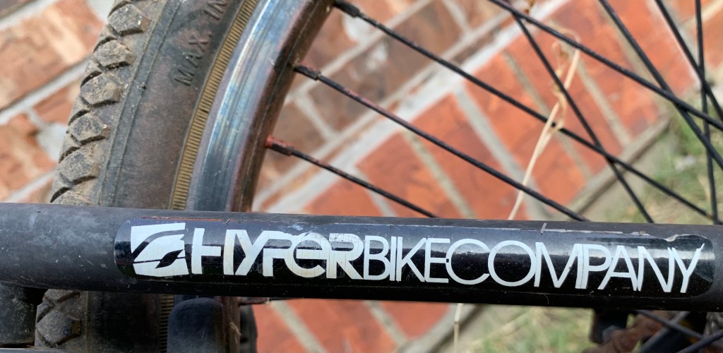
Hyper Bicycles was created in 1990 by BMX pro Clay Godsmid. It originally focused on building BMX racing frames and components. They have since expanded to mountain bikes.
Their typeface logo is an exercise in contrast. Something I learned a little about from Chris Do. From his ebook Typography Manual Vol. 1:
Go from light to bold, or from medium to extra bold when changing font weights. The key to great design is contrast.
– Chris Do
The “Hyper” font is chunky, thick, and bold, like the frame of a freestyle BMX bike. The “Bike Company” font thins out, but remains solid, like a pair of handlebars.
Trying to stand out in a sea of wine, and how to differentiate yourself. What is going to make someone standing in an overcrowded wine aisle pick your bottle rather than someone else’s has to be the biggest challenge.
It’s GRAPHIC DESIGN time.
Some may same say their logo is cliche. But to me, the wine glass silhouette as the horse’s blaze is graphic design brilliance. It turned my head in the wine aisle, and I was on my way to the frozen pizza. The use of negative space takes a few seconds to click in the mind (for me any way), but when it does, the entire brand is seared into your subconscious.
That last sentence might be fluff, but either way it’s a memorable piece.
But the electric scooter company Bird, locked up the “winged” logo game for at least the next 6 months. It’s simple (only 7 lines). It’s distinct (recognizable 30 feet away). And still looks dope sweaty and beaten down.
And going back for seconds, Bird gives you three logos for one. Look close. Can you see the pair of wheels? The pair of raptor eyes? The pair of wings?
I can’t resist hand-painted lettering. A steady hand and brush can enliven any space. Even a restroom hallway.
Papa Lopez Cantina understands this. It would’ve been cheaper, and still effective, to slap the old Men and Women restroom signage to the doors. But somebody in the Papa Lopez art department believed in better.
The Volkswagen logo origin is shrouded in mystery.
Austrian engineer Franz Xaver Reimspiess is said to have received a one time payment of 100 Reichmarks for the logo. Other claims say German artist Martin Freyer designed it for a contest. And in 2005, graphic designer Nikolai Borg went to court for his claims of design ownership.
From what the internet says, the mystery remains unsolved.
This is the 67′ edition of the logo, captured from the hood of a 67’ Beetle.
Pete Doctor is Pixar’s chief creative officer. Recently he sat down for an interview with economist Steven Levitt. On his People I (Mostly) Admire podcast, Steve asked Pete one of my favorite, but ridiculous interview questions. What live advice would you give the 20 year old Pete Doctor, knowing what you know now?
Pete’s response:
I’d probably tell myself draw more. Just get outside and draw, cause your draftsmanship skills are always handy. But more importantly I think, drawing for me, really connects me to stuff. It forces me to see things. I can walk past a house everyday, but then if I stop and draw it I suddenly notice details and things about it that I’d never payed attention to before. So I feel like drawing is a way to slow me down and really connect me to the world that I’m inhabiting that I’m not always fully paying attention to.
An excellent interview for all you drawers out there. Listen in full here.