Spirited
I love when a company is created by a person who loves the product they’re building. It doesn’t always mean success, but at a minimum it’s a genuine attempt to improve things.
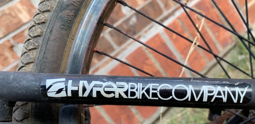
Hyper Bicycles was created in 1990 by BMX pro Clay Godsmid. It originally focused on building BMX racing frames and components. They have since expanded to mountain bikes.
Their typeface logo is an exercise in contrast. Something I learned a little about from Chris Do. From his ebook Typography Manual Vol. 1:
Go from light to bold, or from medium to extra bold when changing font weights. The key to great design is contrast.
– Chris Do
The “Hyper” font is chunky, thick, and bold, like the frame of a freestyle BMX bike. The “Bike Company” font thins out, but remains solid, like a pair of handlebars.
Contrast is king.
