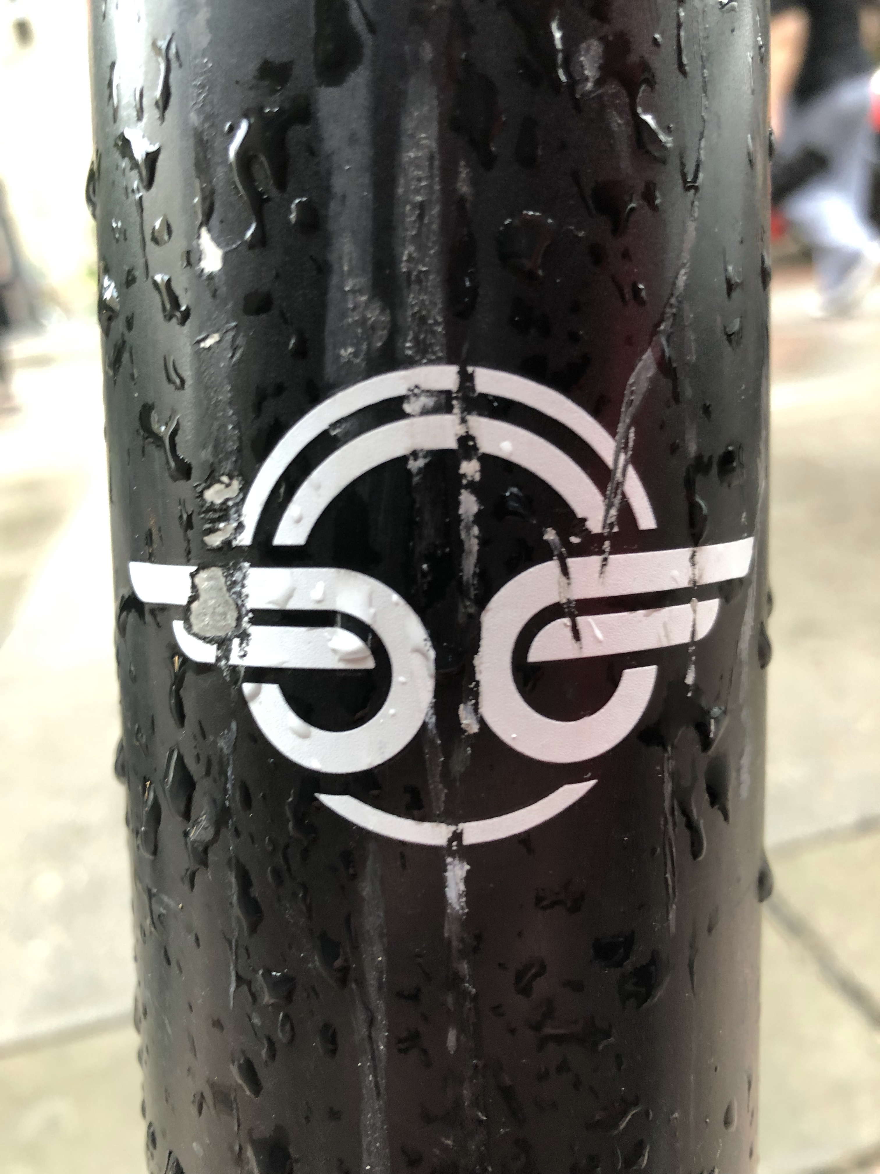
Sweaty and beaten
Throughout the history of graphic design, logos emblazoned with wings are a mainstay.
You have the Detroit Red Wings, Redwing Shoes, The Athlete’s Foot, Birdman’s forehead insignia…
But the electric scooter company Bird, locked up the “winged” logo game for at least the next 6 months. It’s simple (only 7 lines). It’s distinct (recognizable 30 feet away). And still looks dope sweaty and beaten down.
And going back for seconds, Bird gives you three logos for one. Look close. Can you see the pair of wheels? The pair of raptor eyes? The pair of wings?

3 responses to “Graphic Design In the Wild – Day 4: Bird Scooters”
[…] This is one of my favorite football crests, period. The Pitch Black (#000000), California Gold (#c39e6d) color scheme stands out amongst its MLS counterparts. And as I mentioned before, I can’t resist a logo with a well placed “wing”. […]
LikeLike
Incredible post! Thanks for sharing this. Hope for the best.
LikeLiked by 2 people
You’re welcome! Thanks for reading. All the best to you as well!
LikeLiked by 1 person