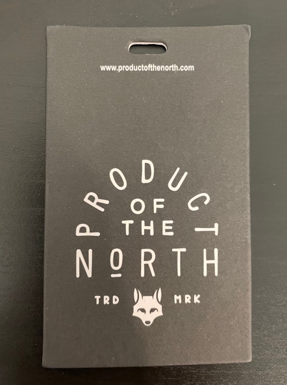
It’s hard to believe, but Product of the North is a company that specializes in one thing: Diaper Bags. But looking at their wordmark and logo, it has the feel of a rugged wilderness brand, rather than a young millennial parent brand.
Their wordmark and fox logo are unified. The designer chose to establish the wordmark hierarchy by rounding the word Product over the rest of the design. He or she then halved the font size (eye balling that) for the less important of the. And then wrapped it up with a full sized North.
The fox in the logo below looks young, but isn’t cute. Which helps reinforce the brand’s mission, creating a diaper bag that men feel comfortable carrying around as much as women.
One word for this design? Unified.
