Meinl is a German percussion company headquartered in Gutenstetten.
Today, Meinl is a known brand amongst American drummers and percussionists, but this wasn’t always true. A strategic Reinhold Meinl led branding effort in the 80s lifted the brand into the global consciousness.
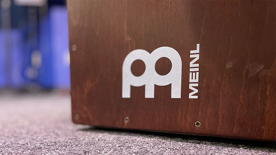
The thick circles introduce the drum and cymbal theme. The “legs” establish the M. The simple shapes keep the logo familiar in any color. The simple shapes and thick lines makes the Meinl logo noticeable from a distance on any cymbal, drum case, amplifier, or band van.
Hero typewriters are a Chinese typewriter brand. Originally known as the Flying Fish PSQ, they were rebranded Hero in the 1980s. The logo’s designer, like many of these we’ve profiled in this series, is unknown (if you know please reach out.)
The Hero logo stands out because of its variety of shapes.
There’s the rectangle that frames the “ero”.
The “H” which looks like a small person finishing their morning stretches has four shapes – the “H”, the arm cubes, the small house shaped silhouette inside the arm cubes, and the vertical space-bars on each side of the “H”.
Finally the oval pulls all the shapes together and gives them a structure to live.
The designer also incorporated Chinese characters and English letters. One could assume this is the word “Hero” written in Chinese, but no need to assume here. Incorporating two languages and two typefaces in one logo is a rare graphic design feat.
For all you typewriter junkies out there check out these two additional articles on Hero typewriters:
On August 8, 1950, in Corpus Christi, Texas, a legend was born. Harmon Dobson opened the first Whataburger burger stand.
An ambitious man, Harmon sought out work opportunities from a young age. He worked as a used car salesman, a diamond courier, an aspiring oil entrepreneur, and a bush pilot.
These work experiences weren’t lost on him when it came time to market his burger stand. Whataburger’s color scheme originated from Harmon’s bush pilot career. To help pilots avoid crashing, radio towers were often painted in alternating bands of International orange and plain white. This color scheme allowed pilots to spot the hazardous radio towers from miles away. And if International orange could catch a pilot’s attention from distance, surely it could catch Dad’s attention while speeding down a Texas overpass.
The iconic flying “W” logo appeared in 1972. Like previous logos we’ve explored in this series, the designer is unknown. We do know the wings on the “W” are an homage to Dobson’s bush-pilot roots. It’s a versatile logo that scales well to fit on caps, webpages, and signage. The sharp diagonal lines of the “W” compliment Whataburger’s A-frame entries.
It can be easy to think of logos only in terms of shapes and typefaces. But a logo’s color shouldn’t be taken for granted. In keeping the International orange and plain white, the “W” logo unifies the whole Whataburger brand.
Harmon’s piloting inspired color choice 71 years ago has proven a graphic design and branding masterstroke.
Founded by Phil Romano in 1996, Eatzi’s is not your typical grocer. Eatzi’s are only located in the DFW area. They’re designed to bring a European market atmosphere to the grocery experience. The hanging cured meats, the fresh selection of cheeses and wines, and yes, the graphic design all contribute to theme.
The color palette of red and white is simple, but eye-catching. The original logo incorporated yellow and green to capture Phil Romano’s Italian heritage.
So with two shapes and two colors, how does the designer grab our attention?
Contrast.
First, note the combination of serif and sans-serif fonts. Then the blend of capital and lower case letters. Interesting design choice here, the lower case serif-font dominates, while the all caps san-serif font supports the main text above.
Alright, one more bit of contrast that I noticed late, the kerning. The main text’s kerning is tight, but balanced, as it spreads across the oval. The support text kerning is wider, giving an elegant feel to the sans-serif font. This is my interpretation of course. A graphic design uber-expert may disagree.
With limited resources a graphic designer must pull from all their tools – form, typography, content and concept. Whoever designed the Eatzi’s logo, mission accomplished.
The Stripe Press logo is what I call a “take two”. It takes two looks to catch the meaning. But once your eyes catch it, you can’t un-see it.
At first glance you ask, is that an 8?Is that a slot car race track?
But then the retro soccer jersey font reveals its self. The “S” overlays the “P”. The combination of the two elicits a feeling of technological progress that remains reverent to the past.
Topo Chico is a staple of scorched Texas summers. The carbonated mineral water is a cool respite from July’s heat.
Topo Chico’s graphic design set and color palette reflects this. The red cursive lettering and the yellow background indicate the heat. While the white strip laid across the top of the cursive lettering gently cools the tone. Earlier iterations of the white strip was snow capped. This white strip also adds depth and contrast to the font, similar to Fiesta.
The mascot, a beautiful Aztec princess (the daughter of Moctezuma I Ilhuicamina) drinking the healing waters of Cerro de la Silla is not only a beautiful illustration, but a tribute to Monterrey.
There’s not many pieces of graphic design that displays richness and beauty. Topo Chico is the exception.
Fiesta Mart began in Houston in 1972. The founders, Donald Bonham and O.C. Mendenhall felt the Mexican American community in Houston was under served.
BOOM! Today there are over 60 Fiesta Marts throughout Texas.
With her parrot mascot and bold font, Fiesta is one of Texas’ most recognizable brands.
The font is what I would call an “in-betweener” (that’s the technical term). It’s not a full serif font. The F and the T have the little feet. But the remaining letters are sans-serif.
Contrast plays an important role here as well. The thick white stroke beneath the red font, pushes the typography forward. Adds depth, and makes the Fiesta logo one of the most unique pieces of graphic design in Texas.
Post Script:
According to Brands of The World.com, the Fiesta Mart logo was designed by an R.Ruiz? But I couldn’t locate a website for him.
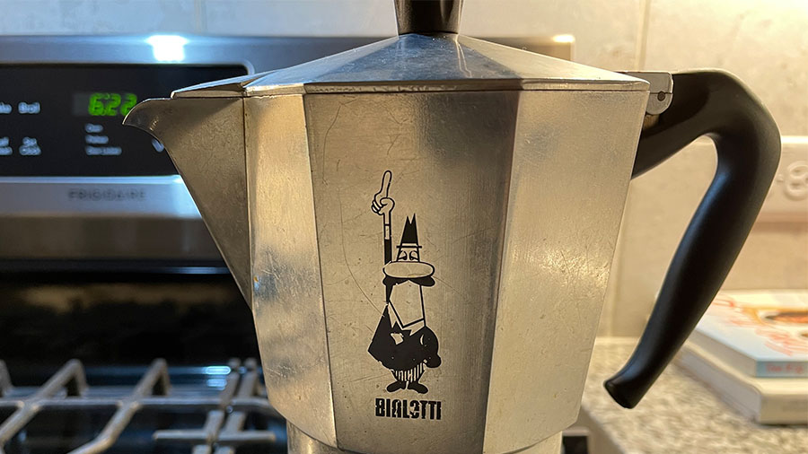
Alfonso Bialetti opened his workshop for aluminum products in 1919. But in 1933 Bialetti released the Moka Express. A first of it’s kind, at home coffee maker. Within a few years, his Moka pot would establish Bialetti as a global company. It remains the most famous home coffee maker in the world (yeah I’m claiming it. Forget you Keurig!).
Part of the Moka Express’ fame is owed to its timeless art-deco design. But the other is owned in part to graphic design. Bialetti’s iconic symbol, the Little Man with the Moustache, first appeared in 1958. The artist, Paolo “Paul” Campani designed the logo as a caricature of Alfonso Bialetti’s son Renato Bialetti. While Paul’s career led him into comics, his foray into graphic design left a historic mark.
Is the l’omino con i baffi a symbol? Is he a mascot? Is he a logo? I’d say a little of all three. The combination of shapes, ovals, triangles, ellipses, rectangles all combine into an instantly recognizable brand.
Alright. This is the DC comics edition. As I was looking these over, I thought what’s the purpose of comics lettering?
My theory is comic book cover lettering needs to “anchor” the cover. It will be the one piece of comic book graphic design that remains the same issue after issue.
The cover art will change, but the title lettering (typically) stays consistent. Comic covers are displayed cover out on spinner racks (R.I.P.) and comic book stores. Good title lettering should immediately reveal who the hero(s) are and what type of adventure you’re in for.
Let’s take a closer look.
Tales of the Teen Titans #63, 1986
Before they were a hit cartoon, The Teen Titans were a superhero group with an ongoing series. Think the mini version of the Justice League.
DC kept their wordmark recognizable for this special Tales of the Teen Titans series by keeping the same font from their 80’s title The New Teen Titans. They did switch the color from red to blue. But it remains a font that coveys strength of the team as a group.
All Star Squadron #28, 1983
The whack Justice League deserves it’s due. It follows a common trend of comic book title lettering, using red and 3D block letters. But it works in three pieces of contrast as well.
ALL is flat and lifted forward with the a white star behind it.
STAR is the largest of the font sizes and has the thickest stroke around the letters.
SQUADRON is slightly smaller and has a star inside the A. Also, the stroke thins out.
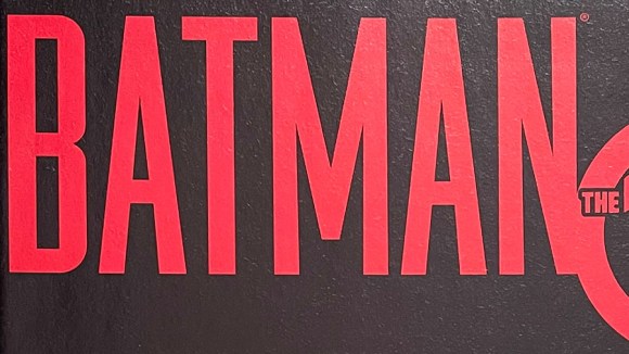
Batman The 10 Cent Adventure, 2002
There’s hundreds of variations of Batman covering lettering. The lettering for the one-off, 10 cent adventure has tall, blood red, san-serif font. The design foreshadows the story of Bruce Wayne being framed for murder.
Starman #13, 1989
One of the cheesiest superheros of all time. Has the name your friend’s little brother would think up on the playground. The lettering follows a similar trend. Red, 3D block letters. Tight kearning. And replacing a letter with a shape. In this case, a star for the A.
These are well executed examples of lettering. But it’s the feelings they evoke about the characters that makes them special.
Let’s take a closer look.
X-Men Grand Design #1, 2017
For Ed Piskor’s Grand Design, you can see the 90s influence of the X-Men cartoon show. Even though it’s paper, you can almost see the volt of electricity flowing through the letters.
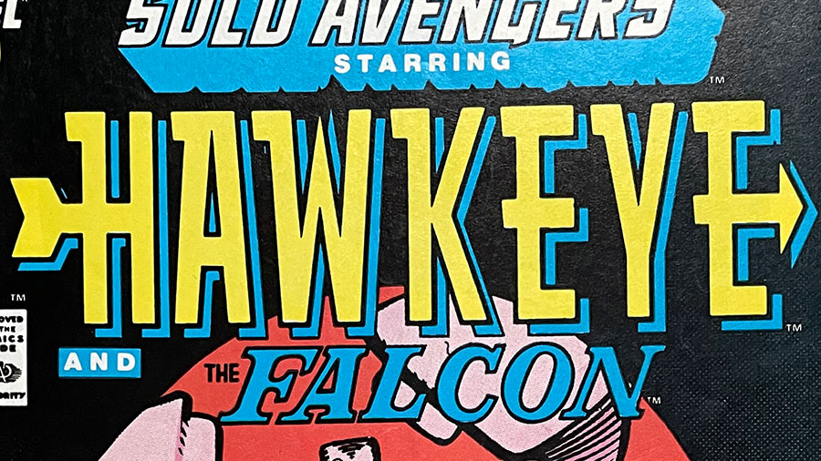
Hawkeye #6, 1988
With Hawkeye’s lettering you get the feeling that this is a hero who’s all about one thing: hitting the target.
Excalibur #3, 1988
The British X-men? Probably too many swords on this one. But it does express a royal, knights of the round table feel.
Fantastic Four #356, 1991
Slapstick. Zany. Funny. Heroic.
The Fantastic Four lettering captures all the energy of what makes the Fantastic Four adventures so well, fantastic!