Don’t fret. I didn’t know what the Summit Series was either. It was an eight game hockey series between Canada and the Soviet Union. This was the first time NHL players filled the Canadian national team roster.
On the surface 1972 looks like a hockey book, but as I read on I discovered it’s a Canadian history book. It’s packed with historical moments most non-Canadians would know nothing of.
See the FLQ crisis. Crisis of national identity is not something unique to the last five years.
On August 8, 1950, in Corpus Christi, Texas, a legend was born. Harmon Dobson opened the first Whataburger burger stand.
An ambitious man, Harmon sought out work opportunities from a young age. He worked as a used car salesman, a diamond courier, an aspiring oil entrepreneur, and a bush pilot.
These work experiences weren’t lost on him when it came time to market his burger stand. Whataburger’s color scheme originated from Harmon’s bush pilot career. To help pilots avoid crashing, radio towers were often painted in alternating bands of International orange and plain white. This color scheme allowed pilots to spot the hazardous radio towers from miles away. And if International orange could catch a pilot’s attention from distance, surely it could catch Dad’s attention while speeding down a Texas overpass.
The iconic flying “W” logo appeared in 1972. Like previous logos we’ve explored in this series, the designer is unknown. We do know the wings on the “W” are an homage to Dobson’s bush-pilot roots. It’s a versatile logo that scales well to fit on caps, webpages, and signage. The sharp diagonal lines of the “W” compliment Whataburger’s A-frame entries.
It can be easy to think of logos only in terms of shapes and typefaces. But a logo’s color shouldn’t be taken for granted. In keeping the International orange and plain white, the “W” logo unifies the whole Whataburger brand.
Harmon’s piloting inspired color choice 71 years ago has proven a graphic design and branding masterstroke.
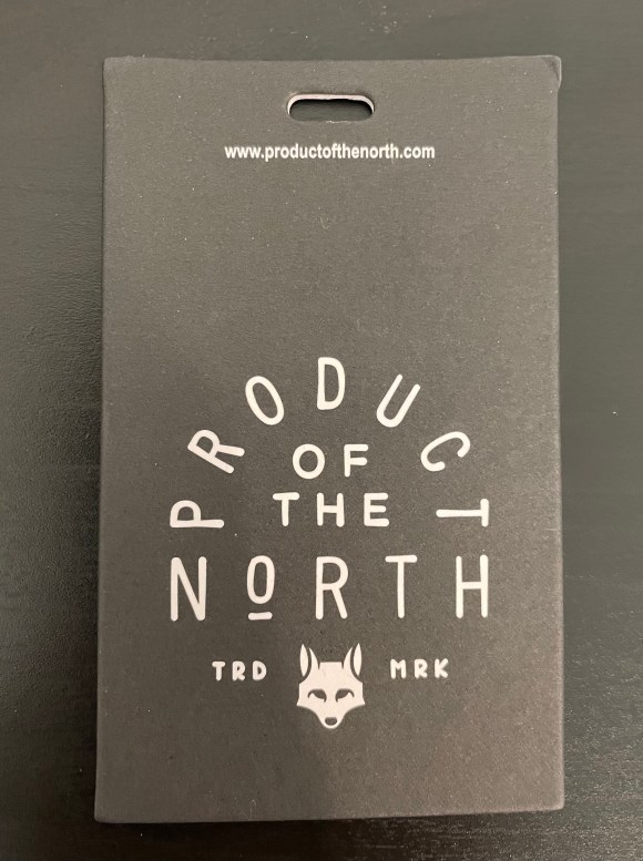
It’s hard to believe, but Product of the North is a company that specializes in one thing: Diaper Bags. But looking at their wordmark and logo, it has the feel of a rugged wilderness brand, rather than a young millennial parent brand.
Their wordmark and fox logo are unified. The designer chose to establish the wordmark hierarchy by rounding the word Product over the rest of the design. He or she then halved the font size (eye balling that) for the less important of the. And then wrapped it up with a full sized North.
The fox in the logo below looks young, but isn’t cute. Which helps reinforce the brand’s mission, creating a diaper bag that men feel comfortable carrying around as much as women.
As the MLS season opens this weekend, I thought we should celebrate with the LAFC crest.
This is one of my favorite football crests, period. The Pitch Black (#000000), California Gold (#c39e6d) color scheme stands out amongst its MLS counterparts. And as I mentioned before, I can’t resist a logo with a well placed “wing”.
When tasked with designing the crest of Los Angeles’ new soccer team, designer Matthew Wolff dug into Los Angeles’ cultural past. What’s amazing is how much of her cultural past he fit into the mark.
The “wing” is a nod to the City of Angels, Aztec Eagles, and Art Deco symbolism. The gold and black palette gives off the air of L.A.’s grit and glamour. And the wordmark is inspired by L.A.’s Art Deco architecture.
A brilliant design, one worth reflecting on often.
Check out Matthew Wolff’s design inspirations for LAFC’s identity here.
I didn’t know it at the time, but video games were one of my first exposures to graphic design. The characters, the symbols, the 8-bit graphics, the cover art, all exposed my 8-year old self to graphic design ideas before I even knew what the term graphic design meant.
Enter the book The Making of Prince of Persia. This book is a collection of Jordan Mechner‘s journal entries while he was creating the game Prince of Persia. This documented journey of bringing a video game to life is a masterclass on book design. We’ll focus on the cover only today.
The Making of Prince of Persia is an example of scale. The designer (not sure who), scaled up the 8-bit prince to fill most of the cover. Leaving enough white space (or blue space) to give the 8-bit prince room to “leap” off the cover. The designer then contrasts the large image with one small DOS font for the title and author name. The DOS font reinforces the books 80s coding theme.
This is a counterintuitive choice for a book cover, but one that works. Usually the title font is large and prominent. But the giant 8-bit leaping prince instills the feeling that this book is an adventure. A page-turning experience you’ve never had before.
The Making of Prince of Persia , and other books by Stripe Press, are designed so well I want them all. Not only for their content, but for their visual beauty.
I’m not sure why, but the first thing that came to mind when I saw this logo was the East India Company. Maybe it was the rust on the shipping container. Maybe it was the word “Mediterranean”. But the two companies are not even close in age or stature. Still, MSC is interesting in her own right.
The Mediterranean Shipping Co is a global shipping and logistics company headquartered in Switzerland, not the Mediterranean.
Their logo is effective in two ways.
It evokes feeling. The thick navy fonts of the M, S, and C feels strong, reliable. It says We will deliver your shipment across any sea. The wavy line under the M reiterates MSC‘s nautical business.
It’s clear. It’s simple. It scales. The fonts are readable at any size. You can scale this logo up to display on the side of a shipping container. Or scale it down to fit on a truckers hat. At either size the logo would be readable. And you’d know for certain, this is the Mediterranean Shipping Company.
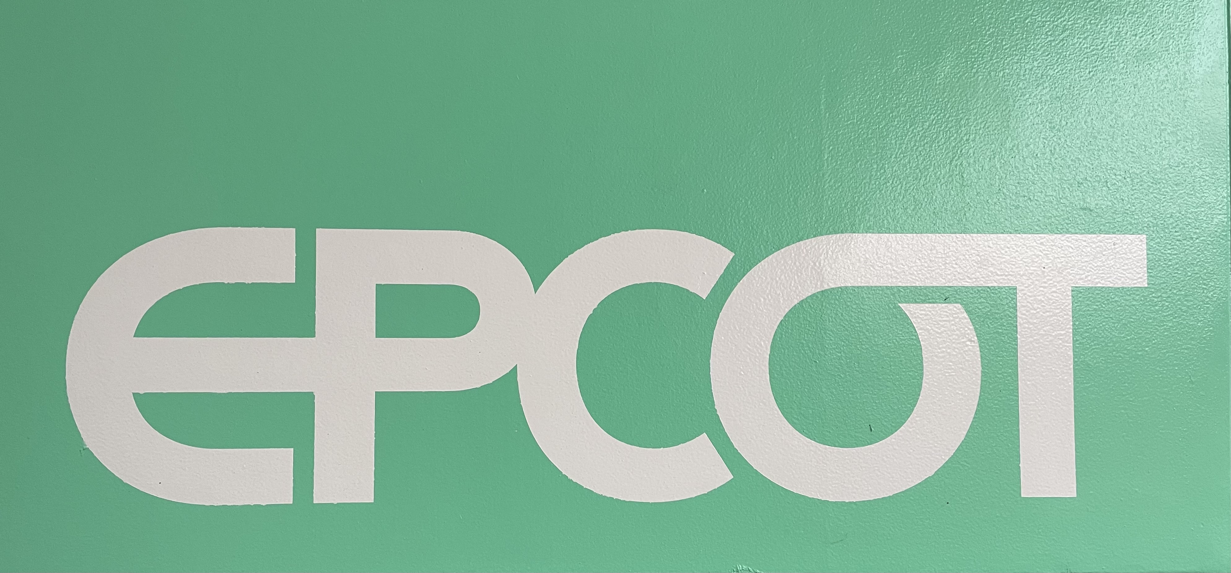
EPCOT opened October 1, 1982. The Experimental Prototype Community of Tomorrow was Walt’s hope for the future of urban design. Alas Walt’s true urban design vision wasn’t realized, but the park remains a graphic design menagerie.
With every step you’re surrounded by typography, logos, icons, poster designs, and signage.
Again, graphic design plays an important role in creating imaginary worlds. EPCOT is no different. The stronger the graphic design, the more realistic the imaginary world around you feels.
I love when a company is created by a person who loves the product they’re building. It doesn’t always mean success, but at a minimum it’s a genuine attempt to improve things.
Hyper Bicycles was created in 1990 by BMX pro Clay Godsmid. It originally focused on building BMX racing frames and components. They have since expanded to mountain bikes.
Their typeface logo is an exercise in contrast. Something I learned a little about from Chris Do. From his ebook Typography Manual Vol. 1:
Go from light to bold, or from medium to extra bold when changing font weights. The key to great design is contrast.
– Chris Do
The “Hyper” font is chunky, thick, and bold, like the frame of a freestyle BMX bike. The “Bike Company” font thins out, but remains solid, like a pair of handlebars.
Trying to stand out in a sea of wine, and how to differentiate yourself. What is going to make someone standing in an overcrowded wine aisle pick your bottle rather than someone else’s has to be the biggest challenge.
It’s GRAPHIC DESIGN time.
Some may same say their logo is cliche. But to me, the wine glass silhouette as the horse’s blaze is graphic design brilliance. It turned my head in the wine aisle, and I was on my way to the frozen pizza. The use of negative space takes a few seconds to click in the mind (for me any way), but when it does, the entire brand is seared into your subconscious.
That last sentence might be fluff, but either way it’s a memorable piece.