Topo Chico is a staple of scorched Texas summers. The carbonated mineral water is a cool respite from July’s heat.
Topo Chico’s graphic design set and color palette reflects this. The red cursive lettering and the yellow background indicate the heat. While the white strip laid across the top of the cursive lettering gently cools the tone. Earlier iterations of the white strip was snow capped. This white strip also adds depth and contrast to the font, similar to Fiesta.
The mascot, a beautiful Aztec princess (the daughter of Moctezuma I Ilhuicamina) drinking the healing waters of Cerro de la Silla is not only a beautiful illustration, but a tribute to Monterrey.
There’s not many pieces of graphic design that displays richness and beauty. Topo Chico is the exception.
Fiesta Mart began in Houston in 1972. The founders, Donald Bonham and O.C. Mendenhall felt the Mexican American community in Houston was under served.
BOOM! Today there are over 60 Fiesta Marts throughout Texas.
With her parrot mascot and bold font, Fiesta is one of Texas’ most recognizable brands.
The font is what I would call an “in-betweener” (that’s the technical term). It’s not a full serif font. The F and the T have the little feet. But the remaining letters are sans-serif.
Contrast plays an important role here as well. The thick white stroke beneath the red font, pushes the typography forward. Adds depth, and makes the Fiesta logo one of the most unique pieces of graphic design in Texas.
Post Script:
According to Brands of The World.com, the Fiesta Mart logo was designed by an R.Ruiz? But I couldn’t locate a website for him.
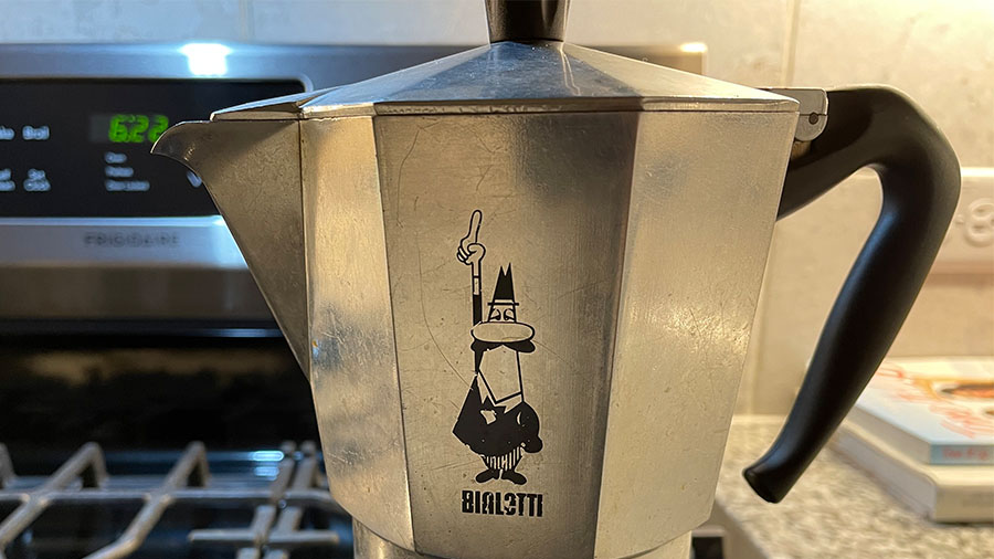
Alfonso Bialetti opened his workshop for aluminum products in 1919. But in 1933 Bialetti released the Moka Express. A first of it’s kind, at home coffee maker. Within a few years, his Moka pot would establish Bialetti as a global company. It remains the most famous home coffee maker in the world (yeah I’m claiming it. Forget you Keurig!).
Part of the Moka Express’ fame is owed to its timeless art-deco design. But the other is owned in part to graphic design. Bialetti’s iconic symbol, the Little Man with the Moustache, first appeared in 1958. The artist, Paolo “Paul” Campani designed the logo as a caricature of Alfonso Bialetti’s son Renato Bialetti. While Paul’s career led him into comics, his foray into graphic design left a historic mark.
Is the l’omino con i baffi a symbol? Is he a mascot? Is he a logo? I’d say a little of all three. The combination of shapes, ovals, triangles, ellipses, rectangles all combine into an instantly recognizable brand.
Alright. This is the DC comics edition. As I was looking these over, I thought what’s the purpose of comics lettering?
My theory is comic book cover lettering needs to “anchor” the cover. It will be the one piece of comic book graphic design that remains the same issue after issue.
The cover art will change, but the title lettering (typically) stays consistent. Comic covers are displayed cover out on spinner racks (R.I.P.) and comic book stores. Good title lettering should immediately reveal who the hero(s) are and what type of adventure you’re in for.
Let’s take a closer look.
Tales of the Teen Titans #63, 1986
Before they were a hit cartoon, The Teen Titans were a superhero group with an ongoing series. Think the mini version of the Justice League.
DC kept their wordmark recognizable for this special Tales of the Teen Titans series by keeping the same font from their 80’s title The New Teen Titans. They did switch the color from red to blue. But it remains a font that coveys strength of the team as a group.
All Star Squadron #28, 1983
The whack Justice League deserves it’s due. It follows a common trend of comic book title lettering, using red and 3D block letters. But it works in three pieces of contrast as well.
ALL is flat and lifted forward with the a white star behind it.
STAR is the largest of the font sizes and has the thickest stroke around the letters.
SQUADRON is slightly smaller and has a star inside the A. Also, the stroke thins out.
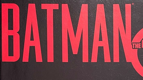
Batman The 10 Cent Adventure, 2002
There’s hundreds of variations of Batman covering lettering. The lettering for the one-off, 10 cent adventure has tall, blood red, san-serif font. The design foreshadows the story of Bruce Wayne being framed for murder.
Starman #13, 1989
One of the cheesiest superheros of all time. Has the name your friend’s little brother would think up on the playground. The lettering follows a similar trend. Red, 3D block letters. Tight kearning. And replacing a letter with a shape. In this case, a star for the A.
These are well executed examples of lettering. But it’s the feelings they evoke about the characters that makes them special.
Let’s take a closer look.
X-Men Grand Design #1, 2017
For Ed Piskor’s Grand Design, you can see the 90s influence of the X-Men cartoon show. Even though it’s paper, you can almost see the volt of electricity flowing through the letters.
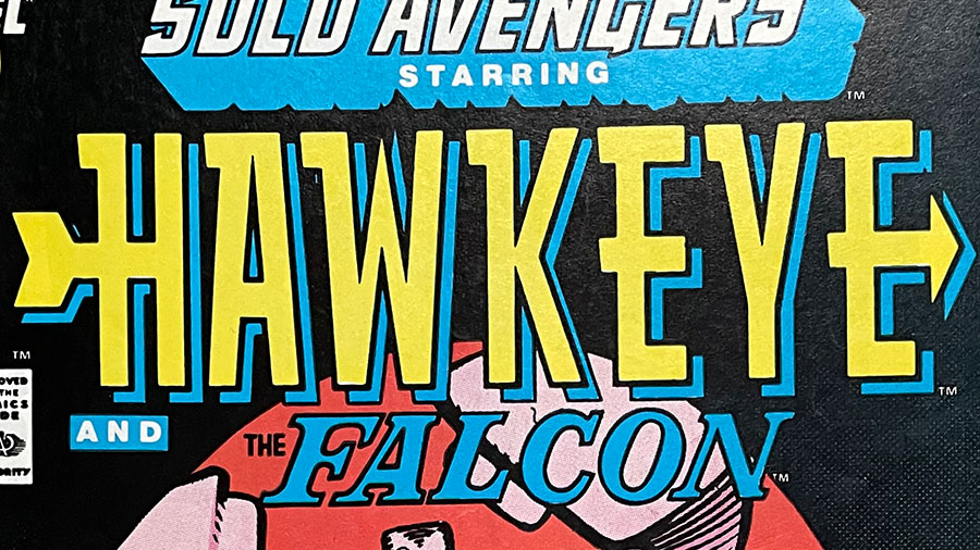
Hawkeye #6, 1988
With Hawkeye’s lettering you get the feeling that this is a hero who’s all about one thing: hitting the target.
Excalibur #3, 1988
The British X-men? Probably too many swords on this one. But it does express a royal, knights of the round table feel.
Fantastic Four #356, 1991
Slapstick. Zany. Funny. Heroic.
The Fantastic Four lettering captures all the energy of what makes the Fantastic Four adventures so well, fantastic!
1836 Farms began in Switzerland in yes, you guessed it, 1836.
Over the century, this organic dairy found its way to Terrell, Texas. They’re unique in that they continue to distribute their milk in glass bottles. Both for better insulation and environmental sanity.
Ok. Two things.
The use of a glass milk bottle silhouette on the cow’s blaze is a great use of negative space. We’ve seen this negative space form before. And we’ll see this form again. But if you have the opportunity to capture a brand’s identity with only two layers (looks like only two layers. Again eyeballing it.) you take it!
The wordmark is a well executed example of contrast. The bold 1836 that frames the silhouette is followed in the hierarchy by the all caps, but lighter serif font at the bottom.
Question: Do you think it’s two different fonts? Or the same font switching from bold to light? Difficult to tell since the top text is numeric and the bottom is letters.
Nothing original here. Negative space, contrast, and clear hierarchy. But with a glance we know what 1836 Farms represents.
Well done!
Post Script:
Don’t forget the feels!
This logo/word mark combination stokes the feeling of a time when daily dairy delivery was taken seriously.
TooJay‘s first opened their doors in 1981. Their original location was in Palm Beach. They’re now celebrating 40 years of cooking up gourmet deli goodness in Florida.
Now on to their logo.
The TooJay’s logo is an example of a letterform with tight kerning that still works. Why does it work? Because the words remain readable.
The designer’s choice of a serif font helps. The serif’s “feet” provide a natural space between the letters even though they sit ankle to ankle.
Sometimes breaking design rules enhances the piece.
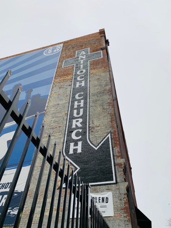
The handed painted sign of the Antioch Church in downtown Dallas is a beacon of leading craft.
The shapes, a cross and an arrow combined, are simple. But I stand in awe at how the designer/painter (I really hope they’re the same person) set the leading so precisely. The spacing between the letters is set to near perfection.
But remember, this is the side of a brick building. Not a collection of Photoshop layers.
There’s no control z. A mistake at this scale is a physical cost. A cost the designer/painter was willing to bear.
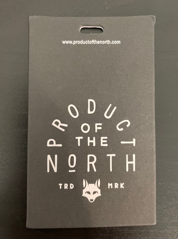
It’s hard to believe, but Product of the North is a company that specializes in one thing: Diaper Bags. But looking at their wordmark and logo, it has the feel of a rugged wilderness brand, rather than a young millennial parent brand.
Their wordmark and fox logo are unified. The designer chose to establish the wordmark hierarchy by rounding the word Product over the rest of the design. He or she then halved the font size (eye balling that) for the less important of the. And then wrapped it up with a full sized North.
The fox in the logo below looks young, but isn’t cute. Which helps reinforce the brand’s mission, creating a diaper bag that men feel comfortable carrying around as much as women.
As the MLS season opens this weekend, I thought we should celebrate with the LAFC crest.
This is one of my favorite football crests, period. The Pitch Black (#000000), California Gold (#c39e6d) color scheme stands out amongst its MLS counterparts. And as I mentioned before, I can’t resist a logo with a well placed “wing”.
When tasked with designing the crest of Los Angeles’ new soccer team, designer Matthew Wolff dug into Los Angeles’ cultural past. What’s amazing is how much of her cultural past he fit into the mark.
The “wing” is a nod to the City of Angels, Aztec Eagles, and Art Deco symbolism. The gold and black palette gives off the air of L.A.’s grit and glamour. And the wordmark is inspired by L.A.’s Art Deco architecture.
A brilliant design, one worth reflecting on often.
Check out Matthew Wolff’s design inspirations for LAFC’s identity here.